Page 38 of 43 FirstFirst ... 28 36 37 38 39 40 ... LastLast
Results 371 to 380 of 430
Like Tree6Likes

Forex Strategies

This is a discussion on Forex Strategies within the Trading Systems forums, part of the Trading Forum category; Talking Points: A Double Top occurs when price tests a previous high and fails. Sell orders can be set just ...


  1. #371
    member ForeCastle's Avatar
    Join Date
    Apr 2013
    Posts
    1,077
    Blog Entries
    236

    The 3 Step Double Top Strategy

    Talking Points:

    • A Double Top occurs when price tests a previous high and fails.
    • Sell orders can be set just below previous high.
    • Profit targets can be set at most recent swing low, stop set 33% of limit distance.


    Forex market volatility is at extreme lows, meaning currency fluctuations have been relatively tame compared to other periods of the time. In order to adapt to these changing conditions, it’s a good idea to add a range trading strategy to your arsenal.

    The Double Top chart pattern occurs when price tests a previous high and fails. This is then followed by a down move. Traders tend to enjoy these types of trades because we can risk a little to make a lot depending on how we want to structure our exit strategy. The Double Top is also a very popular chart formation that tends to trade better in range conditions, so if you’ve never traded it before, now is a great time to learn!

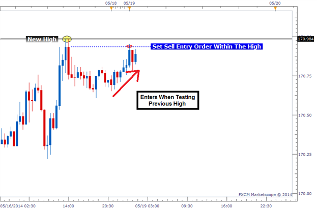
    Step 1: Locate Re-Tests of a Previous High

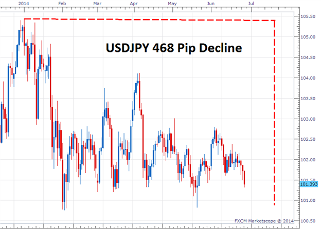
    The beginning of a Double Top formation is a well-defined swing high followed by price moving down. Another way to describe it is price bouncing off a resistance level. We want to draw a horizontal line at the highest price (wick) of the highest candle.

    The image below shows a new high labeled with a yellow circle and a black horizontal line at the highest price achieved during that high. The horizontal line is important because this is how we will gauge where we put our entry.

    Learn Forex: Previous High Being Tested – Triggering a Sell Order


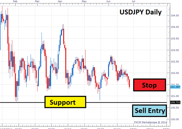
    Step 2: Set Entry Order to Sell Below the Initial Swing High

    The Double Top formation is rarely perfect. Sometimes, price will move up to the exact previous high, bounce, and reverse. But there are also times when price will run past the previous high before reversing, or will reverse before it hits the previous high. Because of this, we have to decide where we want to get into the trade.

    I elect to set my entry order a few pips below the previous swing high to give myself a better chance of getting into the trade. It’s the worst entry price of the three different scenarios, but this is made up for with the Risk Management in Step 3.

    We can see the entry on the previous chart where it entered a few pips below the previous high, marked with a red circle. We sell because we think the previous high will act as resistance and cause price to bounce lower.

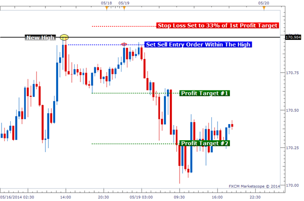
    Step 3: Picking an Exit Strategy

    The exit strategy is straight forward, but it comes in two forms. The first exit strategy involves a single trade with a single stop and limit. The second exit strategy is a two lot trade with a single stop and two limits.

    Learn Forex: Double Top Strategy - Exit Strategy #2


    For a one lot trade exit, we look to place our profit target (limit) at the previous low that occurred between each of the “tops.” We can see Profit Target #1 in the chart above. It lines up perfectly with the swing low. Our stop loss will be 33% of our limit’s distance in pips. So if our limit was set at 60 pips, we would set our stop loss 20 pips away. The stop distance should place the stop loss well above the previous high, protecting it from another test of this resistance level.

    Having a limit set 3x as far as our stop loss gives us a 1:3 RRR (risk-reward ratio). This means we must only obtain a win ratio of 25% or greater to break even or to be profitable in the long run. Being wrong more than half the time and still making money sounds pretty good, and it is. Just remember that this is a lower probability trade and you are likely to have a good amount of losing trades.

    The second exit strategy follows the same rules as above, with Limit #1 at the previous low and a stop set to 33% of that distance. But we add an additional limit twice the distance of Profit Target #1. This allows us to capture more profit on a true double top formation. This second exit strategy gives us an even larger RRR. You may also choose to move the stop to break on the remaining trade once Profit Target #1 is hit.

    Dealing with Double Tops

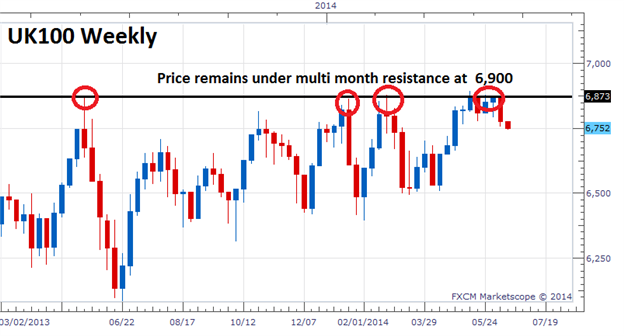
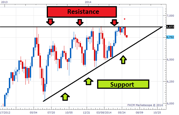
    This 3 step process for trading Double Tops can be used successfully during range bound markets like the markets we have seen lately. Once we identify a swing high; our entry, stop, and limit orders fall into place. With a strong RRR, it doesn’t take a very high win % to be profitable, so I believe it is worth taking a look at.

    Good trading!
    ---Written by Rob Pasche

    More...

  2. #372
    member ForeCastle's Avatar
    Join Date
    Apr 2013
    Posts
    1,077
    Blog Entries
    236

    Has the Stock Market Turned?

    Talking Points:

    • The Uk100 has failed to break over 6,900
    • Price is still trading above support
    • A lower low must be made for the trend to turn

    Stock markets around the world have been making record runs over the past few years. However, with prices taking a pause, many traders are left to wonder if or when their favorite equities indices will turn. While fundamentally this can become a challenge, technical traders can use a series of price action clues to help them identify if indeed the market has turned. Today we will review the UK100 and identify tips to help better time the market. Let’s get started!

    Learn Forex –UK100 Resistance Points


    Support & Resistance

    The first clues that a trend has turned revolve around finding levels of support and resistance. In the event of an uptrend prices must be making higher highs, which in turn suggest rising points of resistance. The chart above displays a weekly graph of the UK100 (FTSE). Even though prices have generally been rising, prices have stalled under 6,900. While the lack of a new high doesn’t suggest that the market has turned, in the absence of a new breakout the trend should be at least in the interim considered stalled.

    Now to get the full story of price action, technical traders should also identify key areas of support. In order for an uptrend to be concluded price must be seen breaking down towards a series of lower lows. These areas can be identified by pinpointing areas of price support. Below we can again see the UK100, but this time we have added an advancing line of support as a series of higher lows have been printed on the chart. In the absence of a breakout or any lower lows, traders can continue to say that the prevailing trend has not changed.

    Learn Forex –EURUSD Trading Blocks


    Trading a Turn

    Even in the absence of new highs or lows traders can begin looking for new trading opportunities. In these scenarios traders should consider trading a breakout. This will allow traders the opportunity to have entry orders pending in the event that price does turn and moves towards a fresh low. Entry orders can also be helpful in the event that a trend continues. If your order is set to sell the market pending a reversal under a point of support and price breaks resistance to a higher high, the order can simply be deleted. Traders will then be free to look for other opportunities.

    ---Written by Walker England, Trading Instructor

    More...

  3. #373
    member ForeCastle's Avatar
    Join Date
    Apr 2013
    Posts
    1,077
    Blog Entries
    236

    What To Make of Gold

    Talking Points:
    -The Big Technical Picture of XAUUSD
    -Trading Triangles
    -Gold’s Make or Break Points on the Charts

    A parabolic move is a term that defines something that moves straight up. After the FOMC decision yesterday, XAUUSD has been on a bullish parabolic move.

    Learn Forex: XAUUSD Went Parabolic Close to Fibonacci Resistance


    The Big Technical Picture of XAUUSD

    XAUUSD, or Gold, has been on a steady downtrend since peaking out in late 2011. The corrections against the downtrend have been short-term in time and price relative to the downtrend. When looking at expiration of a correction or reversal of a trend, you often want to look for a break of a prior corrective high. XAUUSD has yet to do that, which brings up the potential for a resumption of a downtrend or another pattern worth discussing.

    Looking for price action breaks is a key way to look to price action alone for trading signals.
    Learn Forex: Weekly Gold Chart


    Trading Triangles

    Triangles can be a frustrating technical formation to trade. The main purpose of a triangle is to chew up time until either the bulls or bears take over with smaller and smaller moves until a breakout forms. If you stand back and connect the recent extremes from June ’13, you can see that XAUUSD may be tracing out a triangle. One key note about triangles is that they often correct the prior trend and provide one last breather before a move finishes. Therefore, the prior downtrend would favor a triangle break lower, but not before the potential for much higher prices in the yellow metal.

    Learn Forex: Potential Triangle Formation on XAUUSD


    Gold’s Make or Break Points on the Charts

    The near-term momentum currently favors Gold bulls. However, if a triangle is truly in play then there are three key levels you should be aware of to see if XAU is soon to turn around back down or break much higher. However, there are levels below that you should know as well.


    As you can see, the key levels are taken from a mixture of price action extremes or fractals. Fractals can be a great way to build a bias for your swing trading. Other key levels above are taken from Fibonacci levels from the past key range. Today, XAUUSD has traded at its highest levels since mid-April, which will bring about a lot of excitement but as traders, you have to keep your head straight by focusing on key levels holding or breaking on a longer-term chart.

    Happy Trading!
    ---Written by Tyler Yell, Trading Instructor

    More...

  4. #374
    member ForeCastle's Avatar
    Join Date
    Apr 2013
    Posts
    1,077
    Blog Entries
    236

    How High Can US Oil Go?

    Talking Points

    • The 5-year Wedge
    • Pending Breakout?
    • Key Levels Ahead

    US Oil and UK Oil or Crude & Brent have been unexciting on a long-term chart since 2009, but that could change rather drastically in the near future given a few fundamental and technical developments. Recently, we’ve seen other commodities like Gold show up with very bullish moves. Given the wedge patterns across many commodity crosses, these moves are a breath of fresh air.

    The Multi-year Wedge


    If you’re unfamiliar with a wedge pattern, here’s a quick breakdown. A wedge or triangle is a technical pattern that often precedes a thrust in the direction of the prior trend. USDJPY printed a heavily watched triangle from May ’13-Oct ’13.

    Learn Forex: USDJPY Triangle Followed By Thrust Higher


    The chart above should make you familiar with two things. First, that triangles exist as a corrective move against the overall trend. Second, when a triangle expires, a move higher is often the result. Now, let’s look at both UKOil & USOil

    Learn Forex: Triangles Triangles Everywhere


    UK Oil looks a little cleaner for an upside push should the triangle play out as presented. However, each chart shows a triangle in play since 2011 and a correction that started in 2008, potentially coming to an end.

    Pending Breakout?

    By looking at the larger picture, both USOil & UKOil could be on the verge of a breakout due to exhausting triangle patterns. In order to validate the breakout, we can look to correlated markets to see if their also on the verge of a breakout. In the world of currencies, we have noticed a positive correlation to GBPUSD & UKOil.

    Learn Forex: GBPUSD Overlaid on UKOil


    GBPUSD overlaid on UKOil shows a rather clean correlation. In other words, when GBPUSD moves down significantly, so does UK Oil and vice versa. Looking to a long-term GBPUSD, a break-higher from a 5-year correction could be upon us and if that’s the case, the correlation just shown would argue upside in UKOil & likely US Oil.

    Learn Forex: Long-term GBPUSD Chart


    The red line on the chart sits around 1.7046 anchored to the pivotal corrective low in 2005 before hitting a top price of 2.1160. That level was also the corrective top in 2009 and a triple top level in the late 1990’s. If the market does have a memory and the 1.7040 level doesn’t hold GBPUSD down, then a move higher could be in store and correlations could take Oil with it.

    Key Levels Ahead

    US Oil is pushing long-term resistance now and could have a hard-time without a boost from a weaker USD. Last week, Janet Yellen seemed to show the Fed as a non-threatening central bank to those fearing an abrupt hawkishness at this stage. If the Fed’s tone remains the same for the foreseeable future, that could favor a weak USD and stronger commodities.


    Indicators like Ichimoku show the Oil is gearing up for a strong move. However, in the end it’s best to look for a key price-action level to give before definitively looking for a breakout.

    Happy Trading!
    ---Written by Tyler Yell, Trading Instructor

    More...

  5. #375
    member ForeCastle's Avatar
    Join Date
    Apr 2013
    Posts
    1,077
    Blog Entries
    236

    A Basic USDJPY Breakout

    Talking Points:

    • The USDJPY has declined as much as 468 pips for 2014
    • In a Downtrend, breakout traders will sell as price moves under support
    • Entry orders can be used for breakout entries

    Trend traders often find themselves looking for answers when a directional market comes to a screeching halt. Below is a perfect example on the USDJPY. The pair as seen below, has declined as much as much as 468 pips for the 2014 trading year, but has neglected to form a new low since February! So how can trend traders approach the market when prices have stalled?
    Today we will answer that question and more by looking for breakout trading opportunities with the trend. Let’s get started!

    Learn Forex – USDJPY Daily Trend


    Trading Breakouts

    After finding the current line of support in a downtrend, implementing a breakout strategy takes just a few basic steps. Below, we can again see the USDJPY daily chart, with the current line of support identified at 100.75. This point on the graph is currently acting like a pricing floor. Breakout traders will wait for price to move through this area of support, and create a new low before entering into the market. The idea behind this strategy is to enter into the market on the creation of a lower low, with the expectation of price continuing in the direction of the primary trend.

    One of the most prevalent ways of preparing for a price breakout is through the use of an entry order. An entry order can be set through the FXCM Trading station and allows you to trigger an order once the market has reached a designated price. In the event that price reaches the selected value, your order will be executed and your trade triggered into the market! This method of trading is very popular with traders, primarily because you don’t have to constantly monitor charts. Regardless if you are in front of your trading screen or not, your trade is scheduled to execute as soon as a breakout occurs!

    Learn Forex – USDJPY Breakout


    Stops and Limits

    While designing a breakout trade, traders should consider how to manage their risk. This can be done through the placement of a pending stop order in tandem with the previously discussed line of support. In the event that price moves back above support, traders should consider the possibility that a false breakout has occurred. Using this logic, stop values can be placed above support to exit positions in anticipation of the market turning.

    Once a stop is set, traders can then manage their profit targets by using a positive risk: reward ratio of their choosing.

    ---Written by Walker England, Trading Instructor

    More...

  6. #376
    member ForeCastle's Avatar
    Join Date
    Apr 2013
    Posts
    1,077
    Blog Entries
    236

    Trading Tight USDJPY Ranges

    Talking Points:

    • FX Volatility is at historically low levels
    • Range trading strategies tend to work well in low volatility environments
    • JW Ranger Strategy can help you time entries on range bound currency pairs


    Forex volatility has been slowing down over the past several months. We have seen that low FX volatility is actually very good trading conditions for traders.

    Prices typically don’t move fast, but levels of support and resistance tend to hold.

    Therefore, if you have found your strategy not producing the amount of wins as expected, it could be that your strategy is a trend loving strategy and the market simply isn’t trending.

    Today, I wanted to share with you a strategy that was presented in 2011 and how you can apply it to a range bound environment.


    JW Ranger Strategy

    The JW Ranger Strategy uses divergence readings on the Commodity Channel Index (CCI) oscillatorrelative as prices move into a support or resistance zone. In essence, we are looking for slowing momentum in price (divergence) coupled with price entering a supply or demand zone which can act as a reason to reverse short term prices.

    Divergence into support and resistance is the critical element of the entry trigger on this strategy. The suggested time frame of the trading chart is 15 minute to 1 hour, with my preference being the 1 hour intraday chart.

    If you would like to incorporate a portion of your own analysis, that is quite ok because, remember, the critical element is divergence into support or resistance.

    Suggested Reading: The JW Ranger Strategy

    Learn Forex – USD/JPY Range Strategy


    If you are not sure how to identify support and resistance levels, one simple method is to use a 2 day high or low.
    On a daily chart, identify the highest high and the lowest low for the past two days, not including the current day.
    For example, if today is Thursday, then look for the highest high for Tuesday and Wednesday and note that price on your 1 hour chart. Then, look for the lowest low for Tuesday and Wednesday and note that price on your 1 hour chart.

    Note, the current price on the current day, may already be outside that range noted on the 1 hour chart. That is ok; continue to look for entry signals below.

    Learn Forex – USD/JPY Intraday Buy


    Once your highest high and lowest low are notated on the 1 hour chart, then add the CCI oscillator with a 14 period input value onto the chart.
    Once prices have passed above the high level noted, or once prices have passed below the low level noted on the 1 hour chart, then wait for the divergence signal to appear.
    Once divergence appears, then we have our entry signal.

    The stop loss is set at 50% of the daily ATR value. From the daily chart, you’ll notice the daily ATR is 43 pips. So the stop loss would be half of 22 pips in this case.

    The take profit level is set at 50% of the daily ATR value. The take profit level would be the same as the stop loss at 22 pips.
    This establishes a 1:1 risk to reward ratio.

    With the recent tight range on the USDJPY, it would be a good candidate to trade this strategy. Other currency pairs that are trading in small ranges can be instruments to trade this strategy on as well.

    ---Written by Jeremy Wagner, Head Trading Instructor, DailyFX Education

    More...

  7. #377
    member ForeCastle's Avatar
    Join Date
    Apr 2013
    Posts
    1,077
    Blog Entries
    236

    Tactics for Trading Trendlines

    Talking Points

    • In an uptrend, trendlines develop by connecting a series of lows
    • Depending on the trend, trendlines will act as support or resistance
    • Traders can use an oscillator, like CCI, to time market entries


    Drawing trendlines is an important skill for every Forex trader to master. These lines of support and resistance can be drawn on virtually any graph, regardless of the timeframe which makes them incredibly useful in trend based strategies. The key is to match up a series of higher lows in an uptrend and lower lows in a downtrend.

    For today’s lesson, we will be look at a detailed example of drawing and trading trendlines with the AUDUSD.

    Below is an excellent example of an active trendline on a AUDUSD 1 Hour chart. Since the price trend is headed up, the trendline is created by connecting a series of lows on the chart. The key to this process is to find the first two points and connect them together. From this point, simply extrapolate the trendline. Now you will have an ascending line of support to work with when you go to execute your trading strategy.

    Learn Forex – AUDUSD Trendline


    Once the trendline is drawn, traders will begin looking for areas to enter new positions. One of the easiest solutions is to trade price as it bounces off support. This process can be aided through the use of an oscillator to time when momentum is returning in the direction of the primary trend. Let’s take a look at an example.

    Below, you can again see our trendline developing on the 1Hour AUDUSD graph. However, this time we have added the CCI (Commodity Channel Index) indicator. Traders will time their entries into the market when prices bounce off our trendline and CCI crosses back above an oversold value of -100. These dips in the market often happen after a breakout, and traders will be ready to place new buy orders in expectations of price making a new high.

    Learn Forex – AUDUSD Trendline and CCI


    If you’re not familiar with the CCI indicator, that’s ok! It may be similar to other trading tools you are already using. To learn more about the indicator you can also sign up for the CCI trading course linked below. Registration is free, and the course will allow you to work through a series of videos, checkpoint questions, and access more CCI strategies. Get started using the link below.

    ---Written by Walker England, Trading Instructor

    More...

  8. #378
    member ForeCastle's Avatar
    Join Date
    Apr 2013
    Posts
    1,077
    Blog Entries
    236

    Market Entries with Moving Averages

    Talking Points:

    • MVAs show the average price of a currency for a specific number of periods
    • As price moves so will the indicator, giving clues about the current market
    • Traders can filter a trading decision based on the position of price relative to a MVA

    Simple Moving Averages (MVAs) are considered to be some of the most versatile and widely used indicators across markets and time frames. Typically, MVAs are used for filtering price action, as well as planning potential market entries. Today, we will continue our look at moving averages and review how they can be used for timing market entries. Let’s get started!

    MVAs and the Trend

    If you are unfamiliar with moving averages, don’t worry! These indicators operate exactly how they sound. Moving averages by design average out the closing price for a specific number of periods on the graph. For instance the 200 period MVA will add up the closing price for the last 200 periods, and then divide out that sum by 200. The indicator calculates the average for the trader, and then plots the point on the graph as a frame of reference.

    A few of the most popular MVAs used in markets are the 10, 50, and 200 period averages. Depending on the number of periods selected, these MVAs will become more or less sensitive to changes in price. Normally, because longer term MVAs are less sensitive to any individual price change, they tend to be used as trend filters. If price is below a longer term MVA, the trend may be considered down. In the case of the GBPUSD chart seen below, price is above the 200MVA, so the trend may be considered up.


    MVAs and Entries

    Once the general direction of the market is decided, traders can begin adding a series of shorter term MVAs to decide their market entries. As stated above, the 10 and 50 Period MVAs tend to be popular choices for this task. Traders will look for the shorter term 10 period MVA to cross ABOVE the 50 period MVA to trigger a buy signal in an uptrend. Conversely, traders will look to sell a downtrend when the 10 crosses below the 50. Let’s continue our example on the GBPUSD to get an idea of how this works.
    Below, we have a daily GBPUSD chart. The trend has been filtered with the 200 MVA, but this time we have included a shorter period 10 and 50 MVA as well. Since the trend is up, traders will look to buy the market when the 10 period average passes above the 50.This process can be replicated as long as the primary trend stays in place!


    ---Written by Walker England, Trading Instructor


    More...

  9. #379
    member ForeCastle's Avatar
    Join Date
    Apr 2013
    Posts
    1,077
    Blog Entries
    236

    How to Use Alternating Waves in a Forex Strategy (Part 1)

    The Fibonacci sequence provides the foundation of trading decisions for many traders through the golden ratio. This is the first part of a multi-piece sequence on trading with Fibonacci ratios in determining price projections.

    Fibonacci can be a complicated subject because there are a wide variety of uses and interpretations for it. My objective of the first part of this series is to focus using Fibonacci in alternating waves. Future articles will use the length of alternating waves to aid us in determining entry and exit points of a pair.

    What are Alternating Waves?

    In a three wave move, the alternating waves will be wave A and wave C (or if you label with numbers, wave 1 and wave 3). So in the picture below of an uptrend, the alternating waves are the first wave of the uptrend and the 2nd leg of the uptrend which happens to be the C leg of the pattern (the waves colored in blue).


    So when referencing alternating waves, we are referring to waves ‘1’ and ‘3’ or waves ‘A’ and ‘C’.

    What are the common wave relationships?

    There are many ratios that traders use. We will try to keep things simple and focus only on patterns showing a .618, 1.00, 1.618 or 2.618 relationship.

    These ratios are derived from the Fibonacci number sequence. The Fibonacci sequence is a numerical series where every number is the sum of the preceding two numbers. Here is an example of the first several Fibonacci numbers:

    1, 1, 2, 3, 5, 8, 13, 21, 34, 55, 89, 144, etc

    The ratios mentioned at the beginning of this section are obtained by manipulating the numbers in this sequence.

    .618 = Take any number of the sequence and divide it by the number to the right. As this sequence becomes larger, this ratio closes in to .618.

    1.618 = Take any number of the sequence and divide it by the number to the left. This ratio closes in on 1.618 as the sequence becomes larger.

    2.618 = Take any number of the sequence and divide it by the number 2 positions to the left. This ratio closes in to 2.618 as the sequence becomes larger.


    More...

  10. #380
    member ForeCastle's Avatar
    Join Date
    Apr 2013
    Posts
    1,077
    Blog Entries
    236

    Calculating Leverage & How Much is Too Much?

    Talking Points:

    • How to calculate leverage in a Forex trading account
    • The concept of notional value
    • How much leverage we can use

    Traders are drawn to the Forex for many reasons, including: being the largest market in the world, only having a few major currencies needing to be followed as opposed to 1000’s of companies, and there is a large amount of leverage available to retail traders. It’s that 3rd reason that gets most traders into trouble. So today we will learn how to calculate leverage and learn how much leverage is too much leverage.

    How to Calculate Leverage

    I believe leverage is one of the simplest concepts of trading that most traders misunderstand. The definition of leverage is controlling trades that have a greater value than the amount deposited into our account. So if we have $50,000 worth of trades and we have $10,000 deposited into our account, we are using 5x effective leverage ($50,000 / $10,000 = 5).
    In any situation, we can figure out how much leverage we are using by dividing our total trade size by the amount of funds we have in our account. It’s pretty straightforward. The only catch is that we must convert the value of any non-USD based pairs into US Dollars. We must take into account their notional value.

    So if we have a 40k EURUSD trade, it is a 40,000 Euro or $53,520 trade size (40,000 x 1.3380 = $53,520). 1.3380 equaling the current EURUSD exchange rate. If we have a 25k GBPJPY trade, it is a 25,000 British Pounds or $42,150 (25,000 x 1.6860). 1.6860 equaling the current GBPUSD exchange rate. Once all of our positions have been converted to their notional value in US Dollar terms, we then add the values for each trade altogether and divide them by our account’s equity. The result will be how much leverage we are using.


    How Much Leverage Can We Use?

    So now that we know how much leverage we are effectively using in our accounts, how much leverage should we use? The Forex market is very generous with its available leverage. In the United States, traders can use up to 50:1 leverage, in the UK, 200:1 leverage, and in some parts of the world, as much as 400:1 leverage can be used! But we don’t want to use leverage just because we can; we need to analyze how much leverage we should use just like we would analyze a trading strategy before we use it.

    Luckily, DailyFX has analyzed the effect that leverage has on retail Forex accounts through our 2011 study “Traits of Successful Traders”. The goal of this study was to figure out what sets apart profitable traders from unprofitable traders, with one section of this 4-part study focused on the effect that leverage had on an account's profitability.

    Effective Leverage and Profitability Ratio


    The chart above shows that of accounts using 26 times effective leverage, only 21% of those accounts were profitable. For accounts using 6 times effective leverage, 33% of those accounts were profitable. And for the final group of accounts that used 5 times effective leverage, 37% of those account were profitable. So we can clearly see that the amount of leverage used is inversely correlated to the likelihood of being profitable. The less leveraged we used, the more likely we were to being profitable.

    Our conclusion was that we want to aim to use 10 times effective leverage or less because trading with higher than 10 times effective leverage is going to dramatically reduce the likelihood of being successful over the long run.

    Lightly Leveraged

    Using leverage in the Forex market is common, but many traders ignore how much leverage is actually being used. We now know how easy it is to calculate leverage using notional value and the maximum amount of leverage we can use at any given time (10x).

    Good trading!

    ---Written by Rob Pasche

Page 38 of 43 FirstFirst ... 28 36 37 38 39 40 ... LastLast

LinkBacks (?)

  1. 10-09-2013, 09:11 PM

Tags for this Thread

Bookmarks

Posting Permissions

  • You may not post new threads
  • You may not post replies
  • You may not post attachments
  • You may not edit your posts
  •