Page 5 of 12 FirstFirst ... 3 4 5 6 7 ... LastLast
Results 41 to 50 of 114
Like Tree4Likes

Indicators and EAs in MT4

This is a discussion on Indicators and EAs in MT4 within the HowToBasic forums, part of the Announcements category; How to Use Moving Averages Moving averages help us to first define the trend and second, to recognize changes in ...


  1. #41
    Administrator newdigital's Avatar
    Join Date
    Feb 2013
    Posts
    10,474
    Blog Entries
    2911
    Follow newdigital On Twitter Add newdigital on Facebook Add newdigital on Google+ Add newdigital on MySpace
    Add newdigital on Linkedin
    How to Use Moving Averages


    Moving averages help us to first define the trend and second, to recognize changes in the trend. That's it. There is nothing else that they are good for. Any thing else is just a waste of time.
    I won't be getting into the gory details about how they are constructed. There are about a zillion websites that will explain the mathematical make-up of them. I'll let you do that on your own one day when you are extremely bored out of your mind! But all you really have to know is that a moving average line is just the average price of a stock over time. That's it.

    The two moving averages


    I use two moving averages: the 10 period simple moving average (SMA) and the 30 period exponential moving average (EMA). I like to use a slower one and a faster one. Why? Because when the faster one (10) crosses over the slower one (30), it will often signal a trend change. Let's look at an example:


    You can see in the chart above how these lines can help you define trends. On the left side of the chart the 10 SMA is above the 30 EMA and the trend is up. The 10 SMA crosses down below the 30 EMA in mid August and the trend is down. Then, the 10 SMA crosses back up through the 30 EMA in September and the trend is up again - and it stays up for several months thereafter.

    Here are the rules:
    Focus on long positions only when the 10 SMA is above the 30 EMA. Focus on short positions only when the 10 SMA is below the 30 EMA. It doesn't get any simpler than that and it will ALWAYS keep you on the right side of the trend!

    Note that moving averages only work well when a stock is trending - not when they are in a trading range. When a stock (or the market itself) becomes "sloppy" then you can ignore moving averages - they won't work!

    Here are the important things to remember (for long positions - reverse for short positions.):

    1. The 10 SMA must be above the 30 EMA.
    2. There must be plenty of space in between the moving averages.
    3. Both moving averages must be sloping upward.


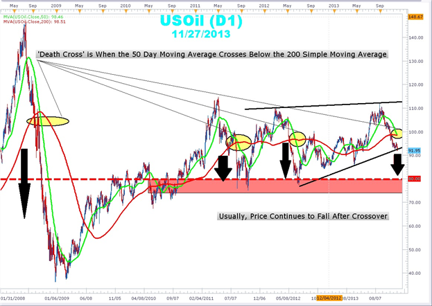
    The 200 period moving average


    The 200 SMA is used to separate bull territory from bear territory. Studies have shown that by focusing on long positions above this line and short positions below this line can give you a slight edge.

    You should add this moving averages to all of your charts in all time frames. Yes. weekly charts, daily charts, and intra-day (15 min, 60 min) charts.

    The 200 SMA is the most important moving average to have on a stock chart.
    You will be
    surprised at how many times a stock will reverse in this area.

    Use this to your advantage!

    Also, when writing scans for stocks, you can use this as an additional filter to find potential long setups that are above this line and potential short setups that are below this line.

    Support and resistance?

    Contrary to popular belief, stocks do not find support or run into resistance on moving averages. Many times you will hear traders say, "Hey, look at this stock! It bounced off of the 50 day moving average!"

    Wrong!

    Why would a stock suddenly bounce off of a line that some trader put on a stock chart? It wouldn't. A stock will only bounce (if you want to call it that) off of significant price levels that occurred in the past - not a line on a chart.

    Stocks will reverse (up or down) at price levels that are in close proximity to popular moving averages but they do not reverse at the line itself.

    So, suppose you are looking at a chart and you see the stock pulling back to, let's say, the 200 period moving average. Look at the price levels on the chart that proved to be significant support or resistance areas in the past.

    Those are the areas where the stock will likely reverse.
    Premium Trading Forum: subscription, public discussion and latest news
    Trading Forum wiki || MQL5 channel for the forum
    Trading blogs || My blog

  2. #42
    Administrator newdigital's Avatar
    Join Date
    Feb 2013
    Posts
    10,474
    Blog Entries
    2911
    Follow newdigital On Twitter Add newdigital on Facebook Add newdigital on Google+ Add newdigital on MySpace
    Add newdigital on Linkedin
    Moving Averages - How to Use Them and Which Ones to Use

    Educational segment on using moving averages in your online stock, futures, or forex trading with Toni Hansen on TradingViews.com.


    Premium Trading Forum: subscription, public discussion and latest news
    Trading Forum wiki || MQL5 channel for the forum
    Trading blogs || My blog

  3. #43
    Administrator newdigital's Avatar
    Join Date
    Feb 2013
    Posts
    10,474
    Blog Entries
    2911
    Follow newdigital On Twitter Add newdigital on Facebook Add newdigital on Google+ Add newdigital on MySpace
    Add newdigital on Linkedin
    New Strategy MACD - EMA


    Premium Trading Forum: subscription, public discussion and latest news
    Trading Forum wiki || MQL5 channel for the forum
    Trading blogs || My blog

  4. #44
    Administrator newdigital's Avatar
    Join Date
    Feb 2013
    Posts
    10,474
    Blog Entries
    2911
    Follow newdigital On Twitter Add newdigital on Facebook Add newdigital on Google+ Add newdigital on MySpace
    Add newdigital on Linkedin
    Multiple Moving Averages & Ribbon Studies

    How to use Multiple Moving Averages & Ribbon Studies for technical analysis when trading stocks and options


    GUPPY MULTIPLE MOVING AVERAGES :

    These are two groups of exponential moving averages. The short term group is a 3, 5, 8, 10, 12 and 15 day moving averages. This is a proxy for the behaviour of short term traders and speculators in the market.

    The long term group is made up of 30, 35, 40, 45, 50 and 60 day moving averages. This is a proxy for the long term investors in the market.

    The relationship within each of these groups tells us when there is agreement on value - when they are close together - and when there is disagreement on value - when they are well spaced apart.

    The relationship between the two groups tells the trader about the strength of the market action. A change in price direction that is well supported by both short and long term investors signals a strong trading opportunity. The crossover of the two groups of moving averages is not as important as the relationship between them.
    When both groups compress at the same time it alerts the trader to increased price volatility and the potential for good trading opportunities.

    ==========

    The Guppy Multiple Moving Average (GMMA) is an indicator that tracks the inferred activity of the two major groups in the market. These are investors and traders. Traders are always probing for a change in the trend. In a downtrend they will take a trade in anticipation of a new up trend developing. If it does not develop, then they get out of the trade quickly. If the trend does change, then they stay with the trade, but continue to use a short term management approach. No matter how long the up trend remains in place, the trader is always alert for a potential trend change. Often they use a volatility based indicator like the count back line, or a short term 10 day moving average, to help identify the exit conditions. The traders focus is on not losing money. This means he avoids losing trading capital when the trade first starts, and later he avoids losing too much of open profits as the trade moves into success.

    We track their inferred activity by using a group of short term moving averages. These are 3, 5, 8, 10, 12 and 15 day exponentially calculated moving averages. We select this combination because three days is about half a trading week. Five days is one trading week. Eight days is about a week and a half.

    The traders always lead the change in trend. Their buying pushes prices up in anticipation of a trend change. The only way the trend can survive is if other buyers also come into the market. Strong trends are supported by long term investors. These are the true gamblers in the market because they tend to have a great deal of faith in their analysis. They just know they are right, and it takes a lot to convince them otherwise. When they buy a stock they invest money, their emotions, their reputation and their ego. They simply do not like to admit to a mistake. This may sound overstated, but think for a moment about your investment in AMP or TLS. If purchased several years ago these are both losing investments yet they remain in many portfolios and perhaps in yours.

    The investor takes more time to recognize the change in a trend. He follows the lead set by traders. We track the investors inferred activity by using a 30, 35, 40, 45, 50 and 60 day exponentially calculated moving average. Each average is increased by one week. We jump two weeks from 50 to 60 days in the final series because we originally used the 60 day average as a check point.


    This reflects the original development of this indicator where our focus was on the way a moving average crossover delivered information about agreement on value and price over multiple time frames. Over the years we have moved beyond this interpretation and application of the indicator. In the notes over the coming weeks we will show how this has developed.

    Our starting point was the lag that existed between the time of a genuine trend break and the time that a moving average cross over entry signal was generated. Our focus was on the change from a downtrend to an up trend. Our preferred early warning tool was the straight edge trend line which is simple to use and quite accurate. The problem with using a single straight edge trend line was that some breakouts were false. The straight edge trend line provided no way to separate the false from the genuine.

    On the other hand, the moving average crossover based on a 10 and 30 day calculation, provided a higher level of certainty that the trend break was genuine. However the disadvantage was that the crossover signal might come many days after the initial trend break signal. This time lag was further extended because the signal was based on end of day prices. We see the exact cross over today, and if we were courageous, we could enter tomorrow. Generally traders waited for another day to verify that the crossover had actually taken place which delayed the entry until 2 days after the actual crossover. This time lag meant that price had often moved up considerably by the time the trade was opened.

    The standard solution called for a combination of short term moving averages to move the crossover point further back in time so that it was closer to the breakout signaled by a close above the straight edge trend line. The drawback was that the shorter the moving average, the less reliable it became. In plotting multiple moving averages on a single chart display four significant features emerged.

    They were:

    • A repeated pattern of compression and expansion in a group of six short term averages.
    • The behavior was fractally repeated across different time frames. These short and long term groups were useful in understanding the inferred behavior of traders and investors.
    • The degree of separation within groups and between groups provides a method of understanding the nature of the trend and trend change.
    • The synchronicity was independent of the length of the individual moving averages. That is, at major trend turning points compression occurred across both long and short term groups and this provided early validation of signals generated by the straight edge trend line
    • The relationship between moving averages and price was better understood as a relationship between value and price. The crossover of two moving averages represented an agreement on value over two different time frames. In a continuous open auction which is the mechanism of the market, agreement on price and value was transient and temporary. Such agreement often preceded substantial changes in the direction of the trend. The GMMA became a tool for identifying the probability of trend development.


    These broad relationships, and the more advanced relationships used with the GMMA are summarized in the chart. Over the following series of articles we will examine the identification and application of each of these relationships.


    This is the most straightforward application of the GMMA and it worked well with “V’ shaped trend changes. It was not about taking the lag out of the moving average calculation. It is about validating a prior trend break signal by examining the relationship between price and value. Once the initial trend break signal is validated by the GMMA the trader is able to enter a breakout trade with a higher level of confidence.

    The CBA chart shows the classic application of the GMMA. We start with the breakout above the straight edge trend line. The vertical line shows the decision point on the day of the breakout. We need to be sure that this breakout is for real and likely to continue upwards. After several months in a downtrend the initial breakout sometimes fails and develops as shown by the thick black line. This signals a change in the nature of the trend line from a resistance function prior to the breakout to a support function after the breakout.

    The GMMA is used to assess the probability that the trend break shown by the straight edge trend line is genuine. We start by observing the activity of the short term group. This tells us how traders are thinking. In area A we see a compression of the averages. This suggests that traders have reached an agreement on price and value. The price of CBA has been driven so low that many traders now believe it is worth more than the current traded price. The only way they can take advantage of this ‘cheap’ price is to buy stock. Unfortunately many other short term traders have reached the same conclusion. They also want to buy at this price. A bidding war erupts. Traders who believe they are missing out on the opportunity outbid their competitors to ensure they get a position in the stock at favorable prices.


    The compression of these averages shows agreement about price and value. The expansion of the group shows that traders are excited about the future prospects of increased value even though prices are still rising. These traders buy in anticipation of a trend change. They are probing for a trend change.

    We use the straight edge trend line to signal an increased probability of a trend change. When this signal is generated we observe this change in direction and separation in the short term group of averages. We know traders believe this stock has a future. We want confirmation that the long term investors are also buying this confidence.

    The long term group of averages, at the decision point, is showing signs of compression and the beginning of a change in direction. Notice how quickly the compression starts and the decisive change in direction. This is despite the longest average of 60 days which we would normally expect to lag well behind any trend change. This compression in the long term group is evidence of the synchronicity relationship that makes the GMMA so useful.
    This compression and change in direction tells us that there is an increased probability that the change in trend direction is for real – it is sustainable. This encourages us to buy the stock soon after the decision point shown.
    The GMMA picks up a seismic shift in the markets sentiment as it happens, even though we are using a 60 day moving average.. Later we will look at how this indicator is used to develop reliable advance signals of this change. This compression and eventual crossover within the long term group takes place in area B. The trend change is confirmed. The agreement amongst investors about price and value cannot last. Where there is agreement some people see opportunity. There are many investors who will have missed out on joining the trend change prior to area B. Now the change is confirmed they want to get part of the action. Generally investors move larger funds than traders. Their activity in the market has a larger impact.

    The latecomers can only buy stock if they outbid their competitors. The stronger the initial trend, the more pressure there is to get an early position. This increased bidding supports the trend. This is shown by the way the long term group continue to move up, and by the way the long term group of averages separates. The wider the spread the more powerful the underlying trend.


    Even the traders retain faith in this tend change. The sell off that takes place in area C is not very strong. The group of short term averages dips towards the long term group and then bounces away quickly. The long term group of averages show that investors take this opportunity to buy stock at temporarily wakened prices. Although the long term group falters out at this point, the degree of separation remains relatively constant and this confirms the strength of the emerging trend.

    The temporary collapse of the short term group comes after a 12% appreciation in price. Short term traders exit the trade taking short term profits at this level of return and this is reflected by the compression and collapse of the short term group of averages. As long term investors step into the market and buy CBA at these weakened prices, traders sense that the trend is well supported. Their activity takes off, and the short term group of averages rebounds, separates, and then run parallel to the long term group as the trend continues.

    The GMMA identifies a significant change in the markets opinion about CBA. The compression of the short term and long term groups validates the trend break signal generated by a close above the straight edge trend line. Using this basic application of the GMMA, the trader has the confidence necessary to buy CBA at, or just after the decision points shown on the chart extract.

    Using this straightforward application of the GMMA also kept traders out of false breakouts. The straight edge trend line provides the first indication that a downtrend may be turning to an up trend. The CSL chart shows two examples of a false break from a straight edge trend line. We start with decision point A. The steep downtrend is clearly broken by a close above the trend line. If this is a genuine trend break then we have the opportunity to get in early well before any moving average crossover signal.

    This trend break collapses quickly. If we had first observed this chart near decision point B then we may have chosen to plot the second trend line as shown. This plot takes advantage of the information on the chart. We know the first break was false, and by taking this into account we set the second trend line plot. Can this trend break be relied upon? If we are right we get to ride a new up trend. If we are wrong we stand to lose money if we stay with a continuation of the downtrend. The straight edge trend line by itself does not provide enough information to make a good decision.

    When we apply the GMMA we get a getter idea of the probability of the trend line break actually being the start of a new up trend. The key relationship is the level of separation in the long term group of averages, and trend direction they are traveling. At both decision point A and decision point B the long term group is well separated. Investors do not like this stock. Every time there is a rise in prices they take advantage of this to sell. Their selling overwhelms the market and drives prices down so the downtrend continues.


    The degree of separation between the two groups of moving averages also makes it more difficult for either of the rallies to successfully change the direction of the trend. The most likely outcome is a weak rally followed by a collapse and continuation of the down trend. This observation keeps the trader, and the investor, out of CSL.
    Looking forward we do see a convergence between the short term group of averages and the long term group of averages. Additionally the long term group begins to narrow down, suggesting a developing level of agreement about price and value amongst investors in April and May. In late March the 10 day moving average closes above the 30 day moving average, generating a classic moving average buy signal.


    Premium Trading Forum: subscription, public discussion and latest news
    Trading Forum wiki || MQL5 channel for the forum
    Trading blogs || My blog

  5. #45
    Administrator newdigital's Avatar
    Join Date
    Feb 2013
    Posts
    10,474
    Blog Entries
    2911
    Follow newdigital On Twitter Add newdigital on Facebook Add newdigital on Google+ Add newdigital on MySpace
    Add newdigital on Linkedin
    Video 10 - How to trade the MACD indicator in Forex


    MACD Technical Analysis Buy and Sell Signals

    Since the MACD uses 26 and 12 EMA to plot, we shall compare these two EMAs with the MACD indicator to determine how these signals are generated.


    The MACD is a leading indicator meaning it generates signals that are leading compared to price action as opposed to lagging indicators that lag behind the price.

    MACD Buy


    A buy signal is generated when there is a MACD fast line crosses above the signal line. However, as with any leading indicator these signals are prone to whipsaws/ fake out signals.
    To eliminate the whipsaws it's good to wait for confirmation. The signal is confirmed when the two lines cross above the zero mark, when this happens the buy generated is a reliable trading signal.
    In the example below, the Moving average generated a buy, before price started to move up. But it wasn't until the MACD moved above the zero line that the signal was confirmed, and the Moving Averages also gave a crossover signal. From experience its always good to buy after both the MACD lines move above zero.


    MACD Sell

    A sell signal is generated when there is a MACD fast line crosses below the signal line. However, just like the buy signal, these are also prone to whipsaws/ fake outs.
    To eliminate the whipsaws its good to wait for confirmation of the signal. The signal is confirmed when the two lines cross below the zero mark, when this happens the sell generated is a reliable trading signal.
    In the example below, the Moving average generated a sell confirmed after MACD moved below the zero line at the same time that the Moving Averages gave a crossover signal.


    Premium Trading Forum: subscription, public discussion and latest news
    Trading Forum wiki || MQL5 channel for the forum
    Trading blogs || My blog

  6. #46
    Administrator newdigital's Avatar
    Join Date
    Feb 2013
    Posts
    10,474
    Blog Entries
    2911
    Follow newdigital On Twitter Add newdigital on Facebook Add newdigital on Google+ Add newdigital on MySpace
    Add newdigital on Linkedin
    Moving Average Crossover - Forex Technicals

    Briefly reviewing ema and sma moving averages and how a moving average crossover can be traded. The moving averages cross as the faster moving average reacts to the more recent price action. If the market turns bullish or bearish the faster moving average will respond to this quicker than the slower moving average, creating moving average crosses.


    What is the ‘Death Cross’ pattern?


    Though its sounds scary and ominous, the ‘Death Cross’ (DC) pattern is neither. In fact, consumers that are tired of paying $80 or more to fill up their gas tank will rejoice at what this pattern means to the price of oil. The DC occurs when the short-term 50-day simple moving average crosses below the 200-day simple moving average. Typically, in a moving average crossover, a shorter term moving average crosses below a longer term moving average a sell signal is generated and price is expected to move lower. What makes the DC different is that the 200-day SMA is watched by so many traders to determine long term bullishness or bearishness that when the 50-day crosses below the 200, the selling can be substantial as institutional and retail selling converge.


    In the chart above there are 4 DCs on USOil which led to significant price moves lower. There is one DC on June 18, 2010 in which the decline was minimal. In fact, since 1984, there has been 21 Death Cross (DC) formations on oil with an average decline of 8.3% over the following 6 months after the crossover. With the current price of oil just south of $92.00 per barrel, we could see a decline down to the $80- $84.00 region once oil closes, on a daily basis, below the current trend line. This will be good news for oil bears and US holiday drivers but bad news for Oil bulls, for now.

    In each of case of the DC, the following price decline was short-lived and a sharp rebound followed. This could give new life and a great entry point for those who are bullish oil. Such a rebound would need confirmation. Oil bulls will wait their turn and may look for the advent of the Golden Cross before initiating longs. The Golden Cross is made up of the 50-day simple moving average crossing above the 200-day simple moving average and is a major buy signal. The DC is nothing to fear if you know which direction to trade. It marks the possible acceleration and extension of and oil “slide” lower.


    Premium Trading Forum: subscription, public discussion and latest news
    Trading Forum wiki || MQL5 channel for the forum
    Trading blogs || My blog

  7. #47
    Administrator newdigital's Avatar
    Join Date
    Feb 2013
    Posts
    10,474
    Blog Entries
    2911
    Follow newdigital On Twitter Add newdigital on Facebook Add newdigital on Google+ Add newdigital on MySpace
    Add newdigital on Linkedin
    Episode 64: Moving Average Envelopes: Simple But Effective Trend Indicators!


    Moving Average Envelopes

    Moving Average Envelopes consist of a moving average plus and minus a certain user defined percentage deviation. Moving Average Envelopes serve as an indicator of overbought or oversold conditions, visual representations of price trend, and an indicator of price breakouts. The inputs of the Moving Average Envelopes indicator is shared below:

    Moving Average: A simple moving average of both the highs and the lows. (generally 20-period, but varies among technical analysts; also, a person could use only the close when calculating the moving average, rather than two)
    Upper Band: The moving average of the highs plus a user defined percentage increase (usually between 1 & 10%).
    Lower Band: The moving average of the lows minus a user defined percentage (again, usually between 1 & 10%).

    A chart of the Nasdaq 100 ETF (QQQQ) shows a 20-day moving average with both a 1% and 2% percentage bands:

    Indicators and EAs in MT4-envelope.gif


    Interpreting the Moving Average Envelopes

    In the chart above of the QQQQ's, the price is not trending. During non-trending phases of markets, Moving Average Envelopes make great overbought and oversold indicators.

    • Buy when the stock price penetrates the lower envelope and closes back inside the envelope.
    • Sell when the stock price penetrates the upper envelope and then closes back down inside the envelope.


    Price Breakout Indicator

    When stock prices are done resting and consolidating, they breakout, in one direction or the other.

    • When prices break above the upper envelope, then buy.
    • When prices break below the lower envelope, then sell.


    An illustration of an upward price breakout is shown above on the chart of the QQQQ's. On the right side, the QQQQ's gapped up above the 2% price band.

    Price Trend Indicator

    A new trend in price is usually indicated by a price breakout as outlined above with a continued price close above the upper band, for an upward price trend. A continued price close below the lower band would indicate a new downward price trend.

    In the chart of the QQQQ's, after the price breakeout, the closing price continued to close above the upper band; this is a good example of how a price trend begins. Soon after, the price will fall back into the Moving Average Envelopes, but the Moving Average Envelopes will be heading in a positive direction - easily identifying the trend as up.

    Moving Average Envelopes is a helpful technical analysis tool for identifying trends and trend breakouts and identifying overbought and oversold conditions. Other similar indicators such as Bollinger Bands and Keltner Channels that adjust to volatility should be investigated as well.


    Premium Trading Forum: subscription, public discussion and latest news
    Trading Forum wiki || MQL5 channel for the forum
    Trading blogs || My blog

  8. #48
    Administrator newdigital's Avatar
    Join Date
    Feb 2013
    Posts
    10,474
    Blog Entries
    2911
    Follow newdigital On Twitter Add newdigital on Facebook Add newdigital on Google+ Add newdigital on MySpace
    Add newdigital on Linkedin
    Moving Average Cloud Trading

    Text made by the author :

    Here I touch on support and resistance, moving averages, trend lines and fractals which is all involved in trading this moving average cloud system.
    Before deciding whether or not to participate in the Forex market, you should carefully consider your investment objectives, level of experience and risk appetite. Most importantly, do not invest money you cannot afford to lose.
    Any opinions, news, research, analyses, prices, or other information contained on this website are provided as general market commentary, and do not constitute investment advice. I am not liable for any loss or damage, including without limitation, any loss of profit, which may arise directly or indirectly from use of or reliance on such information.


    Moving Average Support and Resistance Levels

    Moving Averages can be used as points of support and resistance.

    When price reaches the moving average, the MA level can act as a point of support or resistance for the price.

    Buy Signal

    If price is on an up trend and starts to retrace, then most traders might wait to buy at a better price when the price hits a support level. Traders will sometimes use the MA to determine the support level.

    A buy signal is generated when price hits the MA, turns and starts moving in the upward direction. The signal is confirmed when price closes above the MA. Because many traders use the moving averages to generate trading signals, price will normally react to these levels.

    A stop loss should be set just below the MA. Ideally it should be set a few pips below the previous low.


    Sell Signal

    If price is on a down trend and starts to retrace, then most traders might wait to sell at a better price when the price hits a resistance level. Traders will sometimes use the MA to determine the resistance level.

    A sell signal is generated when price hits the MA, turns and starts moving in the downward direction. The signal is confirmed when price closes below the MA. Because many traders use the moving averages to generate trading signals, price will normally react to these levels.

    A stop loss should be set just above the MA. Ideally it should be set a few pips above the previous high.


    Resistance turns support

    When a resistance is broken it turns into support and vice versa.

    This happens when the fundamentals of a currency change and consequently the direction of a currency pair. The direction change is reflected by the moving average, the direction is confirmed when the resistance turns into support or vice versa (when support turns into resistance)


    Premium Trading Forum: subscription, public discussion and latest news
    Trading Forum wiki || MQL5 channel for the forum
    Trading blogs || My blog

  9. #49
    Administrator newdigital's Avatar
    Join Date
    Feb 2013
    Posts
    10,474
    Blog Entries
    2911
    Follow newdigital On Twitter Add newdigital on Facebook Add newdigital on Google+ Add newdigital on MySpace
    Add newdigital on Linkedin
    This 15 minute video is not related to Moving Average but it is very interesting. Besides, fractals can be used with MA so ...


    What are Fractals?

    The fractals are technical indicators, part of the Bill Williams’ indicators. Unlike any other indicators, this one is not a line or histogram bars; it is just a simple arrow on top of or below the bars of the price chart. These fractals are formed when five consecutive bars align in a strict manner. There are two types of fractals:
    Bearish fractals: this fractal forms over a bar in the price chart, only if the high of this bar is higher than the high of the previous two and next two bars. In real-life trading this fractal indicates a possible bearish movement.


    Bullish fractals: this fractal forms below a bar in the price chart, if the low of this bar is lower than the low of the previous two and next two bars. When you see this fractal, you should expect a bullish movement.


    It is important to mention that the Bill Williams’ fractals are illustrated a bit late on the chart, because you need the fifth bar to close, in order to determine the highest high or lowest low. The fractals are trading signals, but they are far too insufficient to count on them alone: the buy fractal indicates a possible buy order and vice versa.
    Use in Forex


    The fractals point out the strong levels. You can easily draw a line to connect multiple fractals to form either a resistance or a support line. These levels work exactly the same as the trend lines. If you take a look at the image, you will see the resistance line and the buy signal. We get this signal, because the price breaks the strong resistance level. However, if you take a close look at the chart before this moment, you will see a couple of sell signals. This clearly points out how inconclusive are the fractals alone.
    If you have paid attention on the Trend Lines page, you already know that some traders use the fractals to build their trend line. We really like this strategy, but it is not something revolutionary.
    Bill Williams’ fractals and Alligator indicator. These two indicators share great synergy and we will take a quick glance in the image. It is the same as the previous, but we have added the Alligator and this changes the picture quite a lot. Take a look at the buy signal; do you see now why we have not opened a sell order before the buy signal? The price moved above the Alligator and we needed to see a breach of the indicator’s levels and a couple of sell fractals, but did not see that. Instead, the price kept on moving above the Alligator and it even broke the resistance level, which gave us a clear idea of the future movement – buy and take profit.


    Premium Trading Forum: subscription, public discussion and latest news
    Trading Forum wiki || MQL5 channel for the forum
    Trading blogs || My blog

  10. #50
    Administrator newdigital's Avatar
    Join Date
    Feb 2013
    Posts
    10,474
    Blog Entries
    2911
    Follow newdigital On Twitter Add newdigital on Facebook Add newdigital on Google+ Add newdigital on MySpace
    Add newdigital on Linkedin
    Moving Average Clouds Trading, Part #2 (Part #1 is on this post)

    Here is a trading strategy using moving average clouds. This is the same as the previous moving average strategy that I showed using the 100 and 200 MA's but this is just more visual which helps people see things clearer.


    Premium Trading Forum: subscription, public discussion and latest news
    Trading Forum wiki || MQL5 channel for the forum
    Trading blogs || My blog

Page 5 of 12 FirstFirst ... 3 4 5 6 7 ... LastLast

Tags for this Thread

Bookmarks

Posting Permissions

  • You may not post new threads
  • You may not post replies
  • You may not post attachments
  • You may not edit your posts
  •