Sector Rotation
Unsurprisingly, the business cycle influences the rotation of stock market sectors and industry groups. Certain sectors perform better than others during specific phases of the business cycle. Knowing the stage of the business cycle can help investors position themselves in the right sectors and avoid the wrong sectors.
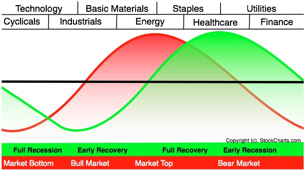
The graph above shows the economic cycle in green, the stock market cycle in red and the best performing sectors at the top. The green economic cycle corresponds to the business cycle shown above. The centerline marks the contraction/expansion threshold for the economy. Notice how the red market cycle leads the business cycle. The market turns up and crosses the centerline before the economic cycle turns. Similarly, the market turns down and crosses below the centerline ahead of the economic cycle.
Cyclicals, which is the same as the consumer discretionary sector, are the first to turn up in anticipation of a bottom in the economy. Technology stocks are not far behind. These two groups are the big leaders at the beginning of a bull run in the stock market.
The top of the market cycle is marked by relative strength in materials and energy. These sectors benefit from a rise in commodity prices and a rise in demand from an expanding economy. The tipping point for the market comes when leadership shifts from energy to consumer staples. This is a sign that commodity prices are starting to hurt the economy.
The market peak and downturn are followed by a contraction in the economy. At this stage, the Fed starts to lower interest rates and the yield curve steepens. Falling interest rates benefit debt-laden utilities and business at banks. The steepening yield curve also improves profitability at banks and encourages lending. Low interest rates and easy money eventually lead to a market bottom and the cycle repeats itself.
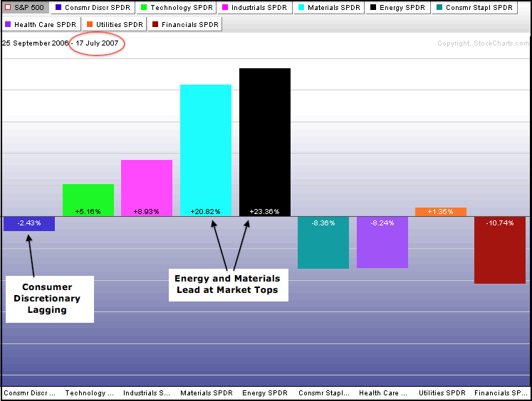
The two sector PerfCharts below show relative performance for the nine sector SPDRs near the 2007 peak and after the 2003 bottom. The S&P 500 peaked from July to October 2007 and broke down in the fourth quarter of that year. In the summer of 2007, the energy and materials sectors were leading the market and showing relative strength. Also notice at the consumer discretionary was lagging the S&P 500. This section action matches what is expected at a market top.
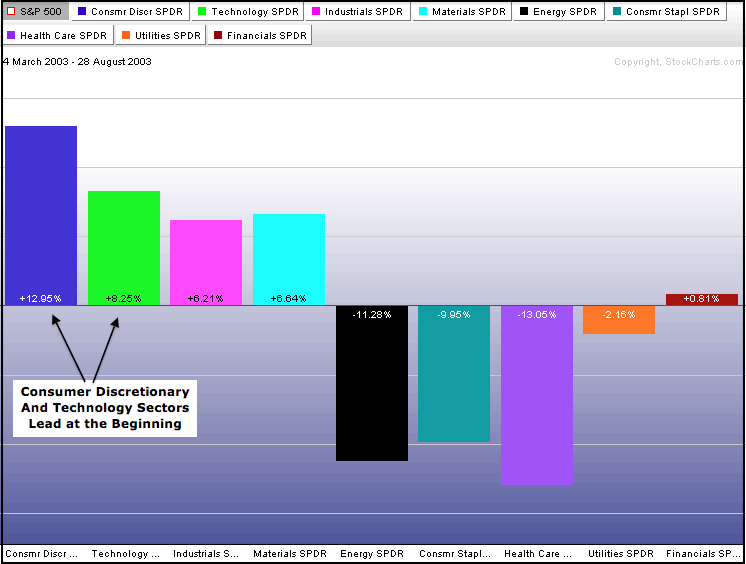
The S&P 500 bottomed in March 2003 and began a powerful bull run that lasted until the peak in the summer of 2007. The consumer discretionary and technology sectors led the first move off the March 2003 low. These two showed relative strength that affirmed the importance of the 2003 bottom.
Conclusion
Intermarket Analysis is a valuable tool for long-term or medium-term analysis. While these intermarket relationships generally work over longer periods of time, they are subject to draw-downs or periods when the relationships do not work. Big events such as the Euro crisis or the US Financial crisis can throw certain relationships out of whack for a few months. Furthermore, the tools shown in this article should be used in conjunction with other technical analysis techniques. The XLY/XLP ratio chart and the Industrial Metals/Bond Ratio chart could be part of a basket of broad market indicators designed to assess the overall strength or weakness of the stock market. One indicator or one relationship should not be used on its own to make a sweeping assessment of market conditions.
Intermarket Analysis article & illustrations courtesy of Stockcharts.com


 9Likes
 LinkBack URL
 About LinkBacks




 Reply With Quote









Bookmarks