MADdash Version 1.20 [Updates Jul 23, 2015]
A multi timeframe Dashboard looking at price's distance from a Moving Average [MA]
Time Frames
You can now have up to 7 timeframes displayed, presuming your screen is Big enough.
Alerting
You can now choose between:
- No alerts
- Silent alerts (the alerts column is active, but no sound or popups appear)
- Alert sounds (you will get the alert sound play, but no popup)
- Alert popups (you will get a popup for every alert)
How does it work?
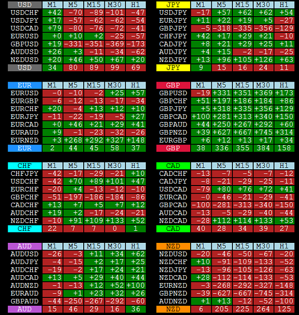
On the left hand side you have the same 8 currency groups that csDash uses.
Please bear in mind that MADdash is still locating "strong" and "weak" pairs just like csDash, but by using a different technique.

For each timeframe, the MA distances are averaged to give a derived MA distance for each currency (the bottom line of each of the 8 boxes)
Green means that price is above the MA, red means that price is below the MA.
These derived figures are then recombined in much the same way that csDash does to give a calculated / theoretical MA distance for each pair:
It is important to note the distinction between the actual MA distance of a pair and the derived MA distance. They are not the same:

The pairs are then sorted in order of the derived MA distance, with the pairs showing the greatest distance (either above or below) towards the top of the list.
You will also see a graph for each TF showing which currencies are "strongest" (showing greatest distance above the MA) and "weakest" (showing greatest distance below the MA)
Finally, there is a column showing active alerts. The alerting criteria at the moment is as follows (hard to explain, I'll come back and edit this later):
TF1 means Time Frame 1 (default is M1)
TF2 means Time Frame 2 (default is M5)
- TF1 base currency >= Alert Threshold, and
- TF1 quote currency <= -Alert Threshold, and
- TF2 base currency > TF1 base currency, and
- TF2 quote currency < TF1 quote currency


 2Likes
 LinkBack URL
 About LinkBacks


 Reply With Quote


Bookmarks