Page 2 of 8 FirstFirst 1 2 3 4 ... LastLast
Results 11 to 20 of 74

Price Action and Patterns

This is a discussion on Price Action and Patterns within the Trading Systems forums, part of the Trading Forum category; Talking Points Price Hovers Near Range Resistance Range Support Sits at 1.4533 Price Above R4 Signals a Breakout EURCAD 30min ...


  1. #11
    member ForeCastle's Avatar
    Join Date
    Apr 2013
    Posts
    1,077
    Blog Entries
    238

    FX Reversals: EURCAD Range Reversal Update

    Talking Points

    • Price Hovers Near Range Resistance
    • Range Support Sits at 1.4533
    • Price Above R4 Signals a Breakout

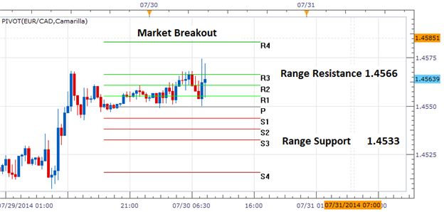
    EURCAD 30min Chart


    For the beginning of Wednesdays trading, the EURCAD remains locked between defined values of support and resistance. Range resistance, as marked above by the R3 camarilla pivot, resides at 1.4566. Range support is found below at 1.4533 creating a 33 pip trading range for the pair. Traders looking for a potential price reversal will monitor the EURCAD under resistance while looking for a move back towards price support.

    A breakout should also always be in consideration, in the event that range bound markets come to a conclusion. Utilizing camarilla pivots, a breakout would be identified by price moving above either the R4 resistance pivot or the s4 support pivot. Currently the R4 camarilla pivot sits at 1.4583.A price advance over this value would signal a change in market conditions, in which traders should consider concluding any range trades. A break of R4 would also suggest a move to higher highs where traders may consider entries with the markets new influenced direction.


    ---Written by Walker England, Trading Instructor


    More...

  2. #12
    member ForeCastle's Avatar
    Join Date
    Apr 2013
    Posts
    1,077
    Blog Entries
    238

    Timing Forex Reversals with Equal Waves (Part 2)

    Article Summary: The Fibonacci equal wave pattern provides us at least a 1-to-2 risk-to-reward ratio trading opportunity. Below, we provide two examples of how you can incorporate the equal wave pattern into your current forex strategy and technical analysis.

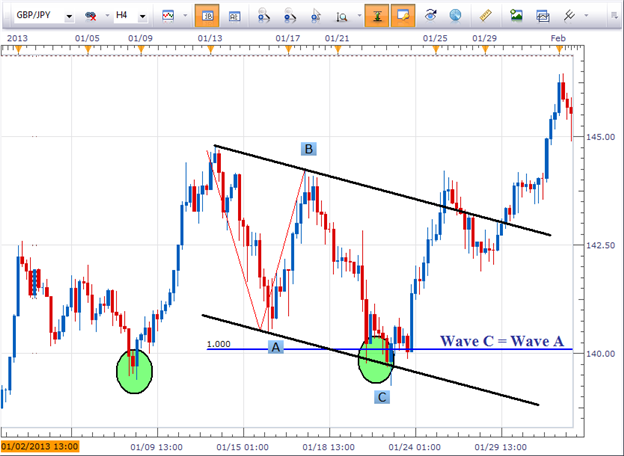
    Remember, the objective of the equal wave pattern is to anticipate where wave C might terminate. Therefore, we draw on the Marketscope charts using the Fibonacci expansion tool connecting the beginning of wave A to the end of wave A, then connecting the end of wave B. So while using the Marketscope charts Fibonacci expansion tool, it requires 3 points to draw the pattern.

    GBPJPY Carves an Equal Wave Pattern


    The GBPJPY has been trending to the upside, so let’s look to the equal wave pattern to time potential reversal zones to buy into this uptrend.

    Learn Forex: Fibonacci and Price Channels


    Notice in the above pattern for the GBPJPY how the equal wave relationship placed a support zone near 140.11. Incorporating other forex technical analysis we can see two additional points of support converging near the similar price zone.

    The black price channel shows support near 139.82. Meanwhile, a previous swing low (green circle) occurred at 139.37. Therefore, with several different points of support all converging near the same price zone AND wave C equals the length of wave A in the same area I can feel confident in the approach of buying the pair in this support zone. If you would like additional levels of confirmation, then you can apply candlestick analysis or use an oscillator to time your entry. In essence, the equal wave pattern suggests levels where prices are likely to see a reaction and pivot.

    Equal Wave and Elliott Wave Theory

    For those who understand Elliott Wave theory, a simple A-B-C move where wave A equals the length of wave C may look familiar to you. A pattern where wave A equals the length of wave C implies it is a corrective move and the whole pattern is likely to be retraced. In the example above regarding the GBPJPY, prices eventually broke to new highs. So if a trader correctly bought in the support zone with a wide enough stop loss to absorb the market’s natural breathing, the potential for upside on the trade would have been a new swing high, nearly 400 pips away.

    No Pattern is Perfect

    You’ll notice in the GBPJPY chart above, prices did not stop at the equal wave length at 140.11. In reality, prices briefly penetrated lower before making the bounce higher. Patterns rarely play out in textbook fashion so don’t be confused if you never seem to find prices stopping exactly at the equal wave length. The equal wave pattern essentially helps you identify higher probability trades with good risk-to-reward ratios associated with them. Let’s look at another example on the NZDJPY.

    Fibonacci Retracements and Fibonacci Expansions
    A question we often get regarding the Fibonacci retracement levels is how do you know which fib line to trade?
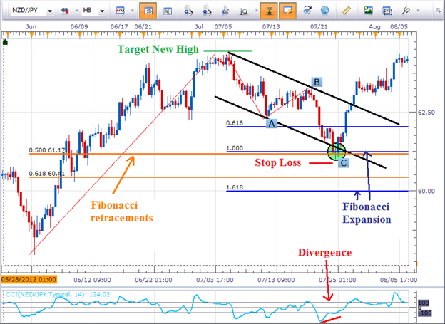
    Well, if you practice measuring out equal waves, you can use the Fibonacci expansion tool to help focus on a particular retracement level.

    Learn Forex: Converging Support with Fibonacci


    In the NZDJPY above, notice how the equal waves level (the blue 1.00 line) is very close to the 50% Fibonacci retracement line (orange line). Additionally, this support zone is close to the support zone offered by the black price channel. So visually, we can see a cluster of support forming on the chart.

    The last piece of confirmation with this trade includes how the CCI indicator is showing divergence. This simply means the momentum is losing steam as prices enter this support zone. Therefore, we have a trade set up incorporating several difference pieces of technical analysis.

    Since this is an equal wave pattern, you’ll want to place your stop loss just below the swing low and target at a minimum a new swing high. In this case it would be risking about 75 pips for the potential reward of 300. It is not uncommon for this pattern to produce at least a 1-to-2 risk-to-reward ratio.

    ---Written by Jeremy Wagner, Head Trading Instructor, DailyFX Education


    More...

  3. #13
    member ForeCastle's Avatar
    Join Date
    Apr 2013
    Posts
    1,077
    Blog Entries
    238

    The Art of Keeping it Simple

    Talking Points:

    • The moving average is easy to compute, and simple to chart.
    • Moving averages can help to smooth out near-term noise and volatility.
    • Moving averages can be used in a variety of ways, and we address the three most popular in this article.

    Simplicity: The indicator’s job is to translate the price action over the relevant period of time (using the inputs selected by the trader or user) to arrive at a particular message.

    The basis for all indicators

    The moving average is probably the most simple to use and understand of all the major technical indicators. It’s simply the past x periods divided by x. This has a smoothing effect, as near-term price movements are registered in scope of the period of activity (x).

    A wise man once told me: ‘Any indicator is really just a fancy moving average.’

    This pretty much blew my mind the first time I heard it, because I had never looked at technical indicators in that way. But surely, upon realization, I understood what the gentleman was getting at. Pretty much every technical indicator is based on past price information (price action). And each indicator has its own mathematical function to derive its value based on that past price action; hence – any technical indicator using past prices is really just a different way of expressing a moving average.

    It’s because of this simplicity that many traders, especially new ones, will often dismiss moving averages as part of their trading approach; under the premise that moving averages ‘don’t work.’
    Well – by this tune, no indicator ‘works.’

    Indicators, like price action, are just ways of looking at what’s happened in the past. And what’s happened in the past may help us to forecast the future, but you have to be honest with yourself in realizing that the past is never going to be perfectly predictive of the future. New events happen, and things change – and this is why technical analysis will never be a panacea; because it will never be a ‘holy grail.’

    But it can help traders get the probabilities in their favor, if even just a little bit; so that those traders can use their trade, risk, and money management to give themselves the best chances of success in the market: Not chasing holy grails, because they don’t exist anyways.

    Three Ways to Proactively Incorporate Moving Averages

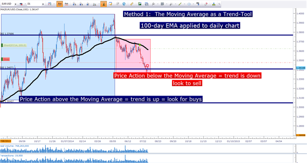
    Moving averages can be a simple way to read and evaluate trends. With price action, this is a very subjective art of observing ‘higher-highs’ and ‘higher-lows.’ The moving average allows you to be objective around this analysis. You can definitively look at your chart and say – ‘this trend is up, so I want to buy,’ or ‘this trend is down so I want to sell.’

    This is using a moving average as a trend-filter.

    Using a 100-day EMA to denote trend in EURUSD (Daily Chart)


    For this purpose, traders can simply apply the moving average to their chart, and look to price action to determine whether the trend is ‘up’ or ‘down.’

    The next job is to find a way to enter in the direction of that trend. If the trend has been up, the trader generally wants to look to buy in an effort to get on the side of that bias if it were to continue. This entry can be done in a variety of ways after the trader has noted the up-trend.

    Another moving average can be used, often on a shorter time frame or using smaller inputs.

    Moving Averages can also be used to enter positions in the direction of momentum


    Traders can also look to indicators like RSI, or MACD in an effort to buy or sell in the direction of the trend by simply waiting for a corresponding signal in the direction of the observed bias. So, for example – if the trader has determined the trend to be ‘up,’ from their moving average analysis – they can look to RSI or MACD to wait for a long-sided trigger.

    Once that takes place, they can look to buy in anticipation of the longer-term trend coming back.

    Lastly, traders can look to moving averages for potential support and resistance implications. One of the more interesting impacts of technical analysis is the idea of ‘self-fulfilling prophecies.’ For example, if enough traders are watching the 200-day moving average on EURUSD, and if those traders are waiting to sell until price runs up to the 200-day moving average (expecting resistance); as soon as that event takes place, and as soon as those traders sell, the additional selling orders bring on price declines. So, the relationship could be stated that price went down because the 200-day moving average reacted as resistance, but in reality there was a key component of that reaction (traders using the 200-day moving average as a trigger).

    Common Moving Average Inputs can help to provide support and/or resistance to a market


    This will generally only take place at ‘common’ moving averages. As in, it’s unlikely to see this effect as vividly on the 34-period EMA on the 1-minute chart as you might see on the 200-period moving average on the daily chart; simply because more traders are likely looking at the 200-day moving average versus the 34-minute average.

    Common intervals for this type of support and resistance are the 10, 20, 50, 100, and 200 period moving averages as seen on the daily chart.

    --- Written by James Stanley

    More...

  4. #14
    member ForeCastle's Avatar
    Join Date
    Apr 2013
    Posts
    1,077
    Blog Entries
    238

    How to Trade a Double Bottom in Forex

    Talking Points:

    • A Double Bottom is formed when price tests a previous low and bounces.
    • Buy orders can be placed just above previous low.
    • Limit orders can be set at most recent swing high, stop set 33% of limit distance.

    With the Forex market showing low levels of volatility, there is a greater likelihood that prior support and resistance levels will hold when price tests those levels again. Because of this, trading a range bound strategy might yield better results, as breakouts are less likely to occur.

    One way to trade ranges, is to look for the Double Bottom chart pattern. It occurs when price tests a previous low and fails, followed by price bouncing higher. This trade setup allows traders to place relatively tight stops and generous profit targets. So we are able to risk a little in an attempt to make a lot with a positive risk:reward ratio.
    Today we learn how to identify these trading opportunities and effectively trade them.

    Locating Re-Tests of Previous Lows

    A Double Bottom pattern starts off with a swing low followed by a sudden rebound higher. In other words, price bouncing off of a fresh support level. At the low, we want to extend a horizontal line out into the future.

    Low Being Made – Highlighted and Price Extended


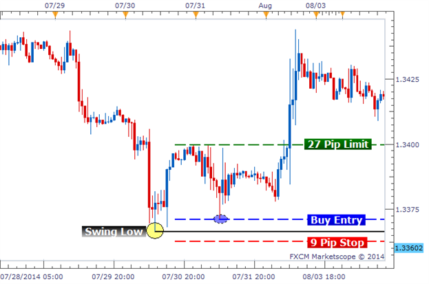
    The chart above gives us a clear example of price bouncing from a swing low and then moving higher. The low is highlighted in yellow with a black horizontal line extending into the future. We draw this line because we will use it to create our trade entry.

    Setting Up Our Trade Entry

    Double Bottoms can be tricky. They won’t always be perfect. There will be times when price will come down and hit the exact low price and bounce higher. But there will also be times when price bounces before reaching the previous low or will bounce after temporarily piercing the previous low. This is the reason why I recommend placing our entry order a few pips above the previous low. This will ensure we do not miss an entry but at a cost of getting a slightly worse entry.

    The chart below shows the previous low labeled with our buy entry order set a few pips above the previous low. We are buying at this level in anticipation of a bounce and the double bottom to be fulfilled. We then will need to setup our exit strategy while we wait.

    Setting Buy Entry for Double Bottom Setup


    Setting Up Our Trade Exit

    So now that our Entry is set up, we need to focus on how we are going to exit our trade. We want to first set our profit target at the previous high that was made following the initial swing low that we highlighted before. The idea is that price will at least be able to have enough strength to test this swing high.

    Once our limit is created, we then want to set our stop loss 33% of the limit’s distance. In our example, the distance between our entry and our limit was 27 pips. That means our stop loss will be set at 9 pips. This accomplishes two goals.

    First, it will place our stop loss beyond the previous low, making it more difficult for price to reach it. And second, it will give us a juicy 1:3 risk:reward ratio. Money management is one of the Double Bottom’s greatest attributes. With a 1:3 risk:reward ratio, we only have to maintain a 25% win rate on our trades to break even. If we have higher than a 25% win rate, we should be profitable in the long run.

    Double Bottom Entry with Stop and Limit Set


    In Conclusion

    The Double Bottom formation is a great opportunity to trade during range bound environments that have low levels of volatility. After identifying a swing low, we can set our buy entry a few pips above. We can then set our profit target at the most recent swing high and a stop order that is 33% of our limit distance. The positive risk:reward ratio allows us to be profitable if we can maintain a win rate above 25%.

    Good trading!

    ---Written by Rob Pasche

  5. #15
    member ForeCastle's Avatar
    Join Date
    Apr 2013
    Posts
    1,077
    Blog Entries
    238

    FX Reversals: USDJPY Morning Breakout

    Talking Points

    • USDJPY Stays Range Bound
    • R3 Resistance Sits at .9320
    • Market Breakouts Signaled Over .9335

    USDJPY 30min Chart


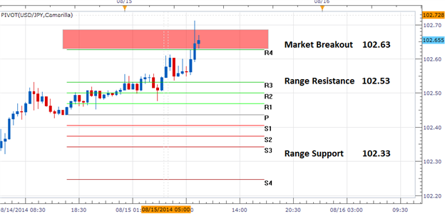
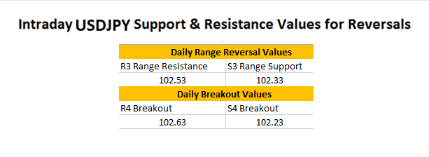
    The USDJPY has broken out above todays R4 camarilla pivot at 102.63 going into Fridays close. This is directly in line with this week’s trend for the pair, as prices have closed at a higher high over the last four trading days. Trend and momentum traders can take advantage of this directional move and continue to look for areas to buy the USDJPY as prices progress towards higher highs.

    In the event that momentum subsides, the USDJPY may produce an environment conducive for a false breakout. This should always be a consideration when volatility wanes and trading for the week comes to a close. A move back below R3 resistance would signal and end of today’s current breakout and suggest a return towards a range bound market. Currently the USDJPY range measures 20 pips, and in the event of a price decline reversal traders should monitor S3 range support at 102.33.


    ---Written by Walker England, Trading Instructor


    More...

  6. #16
    member ForeCastle's Avatar
    Join Date
    Apr 2013
    Posts
    1,077
    Blog Entries
    238

    Trading with the Stars

    Talking Points:

    • Reversal setups can be dangerous due to the fact that the trader is expecting a change in momentum.
    • Risk management is a necessity in reversals, as one ‘bad’ trade can wipe away the gain(s) from numerous others.
    • We look at the Morning Star and Evening Star formation for trading reversals in this article.

    The evening star and morning star formations can be some of the most powerful reversal setups available to traders. In our last article, we looked at the Harami formation, and in this article we’re going to take this a step further with three-candle formations.

    As we discussed in our last article, trading reversals can be a dangerous prospect given that we’re looking to go ‘against the grain’ by expecting near-term price movements to reverse.

    But as we also shared, traders can use a combination of multiple time frame analysis and risk-reward to proactively trade in these types of conditions; so that when they’re wrong, they lose small…but if they’re right, they can look to win big.

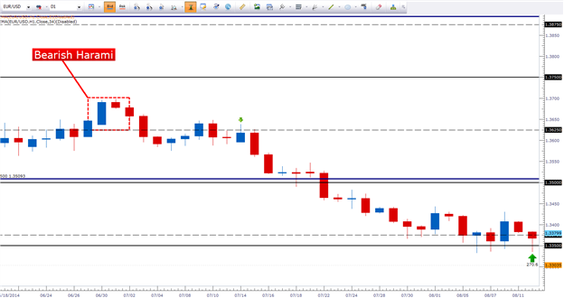
    The Harami is a two-candle formation that looks to trade market reversals at the very early stage of the move. The image below, taken directly from our last article, looks at a recent bearish harami on the EURUSD daily chart.


    As we discussed in our last article, the harami is an early-stage reversal formation. We can take this type of formation a step further by looking for further confirmation in the setup.

    The Evening Star

    The Evening Star is a three-candle formation that looks to trade bearish reversals. The formation is comprised of an initial bullish candle, followed by an indecision candlestick, which is then followed by a follow-through movement that sees the third candle close at least half-way below the body of the first candle. The image below shows the evening star formation in action in EURUSD:

    The Evening Star


    Notice how the evening star took place immediately in-front of a sizable move of over 500-pips. Let’s take a closer look at the formation itself in the image below:


    Think about the message that these candlesticks are telling you as this formation takes place… Buyers push prices higher in the first candle; and in the second sellers enter to take advantage of the new higher prices – seeing buying and selling pressure roughly offsetting. This balance of buying and selling pressure is indicative of dojis, spinning tops, and other ‘indecision’ candlesticks that can often be accented with long wicks and small bodies.

    In the third candle of the formation, sellers take control and push prices at least half-way below the body of the first candle. Once this candle finishes (and confirms the close at least half-way below the body of the initial candle); the formation is complete and the trader can look to initiate a short position with a stop above the high of the formation.

    If the reversal pans out, excellent – the trader can look for three, or four times their initial risk amount. If the reversal doesn’t pan out, then the loss can be mitigated as new highs are made.

    The Morning Star

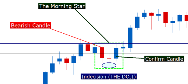
    The Morning Star formation is the exact opposite of the evening star; and is a bullish reversal formation. The image below shows a recent morning star in GBPUSD before the most recent high came into the market.


    Let’s take a closer look at the formation in the below image:


    The Key for Trading Reversals

    As we had discussed earlier in this article and in the previous piece on reversals, what can make the reversal work for traders is risk-reward. Going against the grain isn’t an easy way of trading in a market, and if movements against the trader are left unchecked (with a protective stop) it only takes one or two really bad trades to wipe away everything from that trader’s account.

    So with the evening star and morning star formations, the built in risk management from the formation can be extremely helpful. When looking to buy a morning star, traders should investigate stops underneath the low of the formation, and if confluent support is around that price level – even better.

    Stops for evening star entries should go above the high of the formation, so that if the down-trend doesn’t materialize the trader can exit the position before the loss becomes unbearable.

    --- Written by James Stanley


    More...

  7. #17
    member ForeCastle's Avatar
    Join Date
    Apr 2013
    Posts
    1,077
    Blog Entries
    238

    Trading the Triangles

    Talking Points:

    • The triangle formation can show in three varieties; we outline each below.
    • Triangles signal congestion or consolidation as the range of price movement decreases.
    • Traders can look to trade breakouts by treating triangles like other congestion patterns.

    The Triangle

    Trending markets will often put in a series of ‘higher-highs’ and ‘higher-lows’ (during up-trends), or ‘lower-lows,’ and ‘lower-highs,’ during down-trends. But what about those situations in which price action isn’t putting in higher or lower prices?

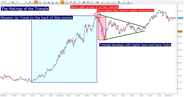
    This can often happen after a market puts in a sizeable move in a short period of time, as buying and selling pressure roughly offset. A prime example of this can be seen in the USDJPY chart, after the massive run the pair put in beginning with the fourth quarter of 2012. After ‘Abe-nomics’ took Japan by storm, traders around the world sold Yen in anticipation of the ‘three arrows’ approach ending the decades-long deflationary spiral that had engulfed the nation.

    In short order, USDJPY had traded from sub-80 to 103.67. The move went so far, so fast that most buyers in USDJPY were already long. So by the time we hit 103, the market was heavily long and much of the announced news was ‘priced-in’ to the market.

    This means there weren’t enough buyers to push prices higher. And the simple act of no new buyers can create a down-swing in price in the same way as an influx of new sellers.

    USDJPY put in a 950-pip drop in a little over three weeks, establishing support slightly inside of 94. But for the next four months, the pair stayed confined between these support and resistance values of 103.67 and 94, making progressively higher lows and lower highs (the opposite of what is wanted for a trending market); and this creating converging trend lines that gave us this symmetrical triangle:

    The Symmetrical Triangle


    Do you notice what happened on the right side of that chart – after the triangle was broken? The trend came right back to order, making a new high above 105. This is why we want to know how to identify these formations when they occur: They can tell us quite a bit about the general market condition and what might be going on. But this isn’t the only type of triangle that we might see on the chart. We can also see ‘biased’ triangles that have a horizontal support or resistance level.

    The Ascending Triangle offers higher lows, with horizontal resistance, and the Descending Triangle is the exact opposite, with lower-highs and a horizontal zone of support, as seen below in the current US Dollar chart:

    The Descending Triangle in the US Dollar Chart


    Trading the Triangle

    Across the numerous sources on the internet that teach triangle trading, many of them attempt to teach traders to carry a bias into these formations.

    As in – during an ascending triangle, many folks will often attempt to look at the formation as carrying a bullish bias due to the higher-lows. But keep in mind – if the market hasn’t been able to make higher-highs, this is not a trend, nor is this necessarily a bias that we can feel good about.

    All that we truly know in the situation of an ascending triangle is that resistance hasn’t been able to budge.
    The direction that the triangle will break is going to be determined by whether more supply or demand comes into the market at the end of the formation; which often happens around news announcements – and these are pretty unpredictable. These are all unknown factors.

    Look at triangles – all of them, whether they are ascending, descending or symmetrical – as congestion patterns and congestion patterns only. All that we truly know from this formation is that supply and demand are roughly off-setting each other over a specific period of time: that’s it.

    And this isn’t necessarily a bad thing, because congestion or indecision formations can be a price action trader’s best friend.

    This goes right back to the allure of trading price action in the first place – in that there are no messages or formations for what will definitely happen in the future. It’s simply a way of analyzing the market to see where we, as traders, may be able to seek out strong risk-reward ratios in which we can make more if we win than we’ll lose if we’re wrong.

    --- Written by James Stanley


    More...

  8. #18
    member ForeCastle's Avatar
    Join Date
    Apr 2013
    Posts
    1,077
    Blog Entries
    238

    Trading the Doubles

    Talking Points:

    • The Double-Top and Double-Bottom formation show multiple tests of support (or resistance) at a particular price level.
    • Traders can look to trade subsequent tests of these price levels.

    The Double-Top/Double-Bottom

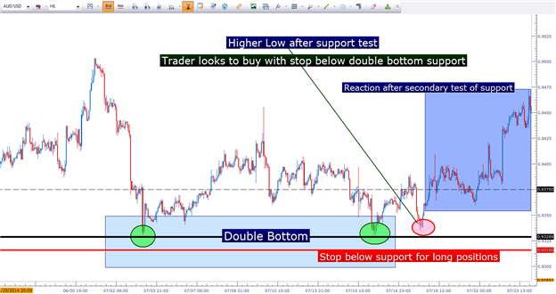
    The Double-Top or Double-Bottom formation will occur when two separate ‘moves’ bounce from a support or resistance level. This highlights that level as being especially strong, so that the next time price encounters this, traders may be able to look for a significant reaction.

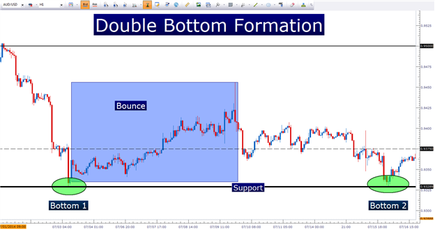
    In the below chart, we take a look at a recent double bottom formation in the AUDUSD pair:


    Notice how price action has reacted to this level of support two different occasions. So the next time that we approach this level of established support, it could be reasonable to assume that some type of reaction may take place.
    Imagine this support level as a theoretical ‘line in the sand’ that can have the potential to pull additional buyers into the mix. But this isn’t necessarily a completely bullish prospect… because after this support level was defended, prices ended up coming right back down.

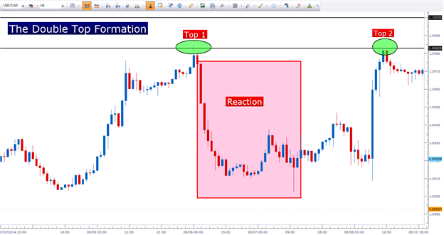
    The exact opposite is true of resistance in the Double-Top formation:


    Notice how this level of resistance on the chart has been validated twice by price action, as sellers have come in to push prices lower once this level was hit.

    How to Trade the Double Top/Bottom Formation

    The default mannerism of trading the double bottom is to look for a bullish price reaction after the second test of support. So, using the same AUDUSD example we had looked at previously, we look at how a trader could’ve approached this formation. After support was hit for a second time, the trader knows that there could potentially be a bullish bias coming into the market. After all, if buyers jumped in to protect the ‘line-in-the-sand,’ they may do so again.

    So after the double bottom was formed – the trader waits: The trader waits for a ‘higher-low’ to come into the market so that they can look to ‘buy low,’ with a stop placed below the level of support at the double-bottom. This way, if the formation doesn’t come to fruition, the loss can be mitigated; but if the formation does come through, then the trader can look to reap more upside than they had to put in to risk.

    Trading the Double Bottom:


    As you can see in the above setup, the real allure of trading the double top or double bottom is the potential to have a really strong support or resistance level to use for the basis of a position’s risk management.

    The exact opposite is true for the double top formation; in which the trader can look to sell ‘lower highs,’ with a stop above resistance so that if that level holds, the trader can look to manage a profitable position… but if the high point of resistance doesn’t hold, the trader can look to exit the position while mitigating the loss.

    --- Written by James Stanley


    More...

  9. #19
    member ForeCastle's Avatar
    Join Date
    Apr 2013
    Posts
    1,077
    Blog Entries
    238

    Trading Strategies Based on Volume, Part 1: Confirming Breakouts

    Talking Points:

    • Volume can increase our win rate when used properly
    • Larger volume during a breakout can confirm the move is valid

    Volume is an extremely popular trading tool when trading stocks, options, futures, and many other instruments. But when it comes to Forex, we do not see many traders using volume. The reason is that the Forex market is decentralized and the overall market volume is not available.

    The solution for this is FXCM’s new Real Volume indicator. While it won’t show us how much volume is being traded world-wide, it will tell us how much volume is being traded in FXCM accounts. Due to FXCM’s large client base, we can use this to determine how volume is fluctuating on a relative basis. Today we look at trading potential breakouts and learn how real volume can validate or invalidate the move.

    Identifying a Breakout

    For those not familiar with a breakout strategy, you may want to check out my “3 Step No-Hassle Breakout Strategy.” In the simplest terms, a breakout occurs when price is able to break above or below a price level that previously price was not able to break above or below. Price levels that act like a ceiling are referred to as resistance areas and price levels that act like a floor are referred to as support areas.

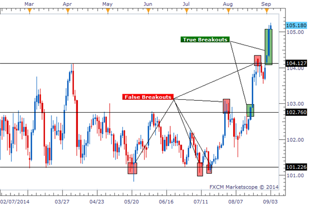
    There are many ways to draw support and resistance levels. We can see on the chart below that there are times when price breaks through these drawn levels, but there are also times when price appears to break higher or lower, but then turns back around. When price movements fake us out like this, it's called a "false breakout." This is the most difficult part about trading breakouts, avoiding the false breakouts.

    Good and Bad Breakout Trades


    Using Volume to Confirm a Breakout

    This is where volume can come in handy. A fundamental principle is that the more volume traded, the more strength and determination the move has. So if we see a large price move that coincides with a large amount of volume, we respect it more than if we saw the same large price move with a small amount of volume.
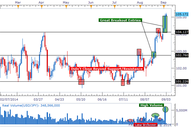
    When we are looking for breakout opportunities, we want to see the breakout occur on large amounts of volume. The chart below shows potential breakout entries and the amount of volume during the break.

    Using Volume to Find Good Entries


    We can see the breakout trades that were filtered out, labeled in red. They were labeled as false breakouts because they either did not close beyond support/resistance or they broke during times of low volume. We want to avoid placing trades based on low volume moves.

    There were only two trades where price closed beyond support/resistance and it occurred during a high amount of volume. Those were also the two times where the breakout continued moving after the breakout occurred.


    ---Written by Rob Pasche


    More...

  10. #20
    member ForeCastle's Avatar
    Join Date
    Apr 2013
    Posts
    1,077
    Blog Entries
    238

    Trading Strategies Based on Volume, Part 2: Confirming Trends

    Talking Points:

    • Volume can help confirm a trend
    • Volume should increase during moves in the direction of a true trend
    • The EUR/USD is a current example of these principles

    Trend trading is a staple in my Forex trading account; identifying the predominant direction a pair is heading and only looking for opportunities that trade in the same direction. But sometimes it is difficult to decipher whether a chart displays a trend or not. It can also be difficult to know when a trend has ended and price begins to reverse. The real volume indicator can help us in both of those respects.

    Volume’s Appearance During a Trend

    Just like we analyze price moves on a chart, we can also analyze volume in a similar manner. Trends are identified as a series of higher highs and higher lows (uptrend) or lower highs and lower lows (downtrend), but volume can show a pattern during a trend as well.

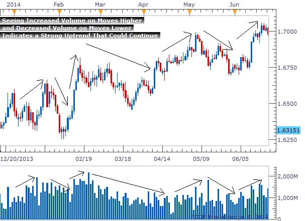
    It is common to see volume increase during times where price is moving in the direction of the trend and decrease when price has a countertrend move. The market is showing more enthusiasm as price is moving in the direction of a trend. During times when price pulls back against the trend, volume then decreases as people show a lack of interest. In the chart below, we can see this explanation in a visual format.

    Volume Increases with the Trend, Decreases During Countertrend Moves


    This currency pair is clearly in an uptrend. Price is making higher highs and higher lows and I’ve taken the liberty of drawing arrows on the chart to mark the key moves up and down. Below price we can see real volume and learn how volume looks during an uptrend.

    Volume increases each time there is a move in the direction of the trend. And volume decreases each time there is a counter-trend move. This lets us know that the trend is strong and could continue into the foreseeable future.

    This chart was somewhat cherry picked to show a very clean example of the relationship between price trends and volume, however. So next I would like to look at a real world example going on right now.

    A Current Example – The EUR/USD
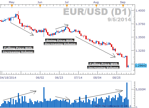
    Yesterday’s enormous drop in the EUR/USD was hard to miss. The pair fell 200 pips in a single day and FXCM had its largest amount of volume traded on the EURUSD since February 29th, 2012. But before this massive move, volume was playing a role in signaling traders to continue to sell.

    The EUR/USD downtrend began back in May when price peaked around 1.4000. Since that point, price has made lower lows and lowers highs with increasing amounts of volume with each leg down. And interestingly enough, when we did see a subtle pullback in the EUR/USD the second half of June, we saw volume decrease.

    As we learned earlier, during a trend, volume will increase when price moves in the direction of the trend and volume will decrease when price moves counter to the trend. That is the exact circumstance we find ourselves in with the EUR/USD.

    EUR/USD Trend and Volume


    The chart above shows the initial downward move accompanied by increasing volume, followed by rising prices alongside decreasing volume, and then the current downward move we are participating in as volume has increased. This is a classic example of volume signaling the real strength of this trend.

    In Conclusion

    Volume can greatly enhance our ability to identify and act on a trending currency pair. As long as we see increasing volume during trend moves and decreasing volume during countertrend moves, the trend could continue for a while.

    ---Written by Rob Pasche


    More...

Page 2 of 8 FirstFirst 1 2 3 4 ... LastLast

Tags for this Thread

Bookmarks

Posting Permissions

  • You may not post new threads
  • You may not post replies
  • You may not post attachments
  • You may not edit your posts
  •