
 LinkBack URL
 About LinkBacks


Pre-Trend Chart Patterns Every Trader Should Know: Part I
Talking Points:
- Benefits of Pattern Recognition
- The First Pre-Trend Pattern: Zig-Zag
- Setting Stops & Profit Targets
“…markets are chaotic in nature, but within this chaos are non-random patterns that repeat and are predictable”
-Larry Pesavento,
Some traders love to look for common price action patterns before entering in the direction of the overall trend to improve the risk: reward ratio. Others however, prefer to steer clear from patterns and focus solely on price action. However, the two are not mutually exclusive and can be combined for a powerful trading combination whether you’re swing trading or day trading.
Benefits of Pattern Recognition
Let’s start off with the mental traps you can get into with pattern recognition. Of course, I’m a trader as well, and if you’re going to make progress and reach your goals, you must have the right mindset. The right mindset has us looking for a methodical edge that we can exploit with the full understanding that there is no guaranteed outcome on any trade, only risk with a favorable edge.
Learn Forex: Sometimes an Edge Works & Other Times they do not
However, pattern recognition has allowed me to enter trades at incredible turns with excellent risk: reward. This article will be the first of a 4 part series on common patterns that you should be aware of that precede the resumption of a trend.
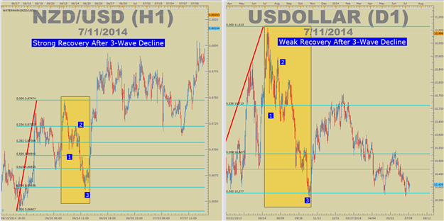
The First Pre-Trend Pattern: Zig-Zag
The patterns that we will cover will span through common Elliott Wave patterns. While there is price action combinations such as pin bars or indecision candles that have a shorter-term focus, such as only a few candles counter-trend, this 4-part series will span the corrections known in Elliott Wave.
In the nomenclature of Elliott Wave, it’s good practice to look for moves against the trend to develop in three-drives. These three wave patterns are what we’re going to focus on so that we can look to their exhaustion. When the counter-trend movement is exhausted, as we can see through price action and common patterns, we can look to enter back in the direction of the overall trend with limited risk in case we’re wrong about our entry and the trend isn’t ready to resume yet.
Learn FX: Idealized Sharp 3-wave Correction (Not Likely on Candle Charts)
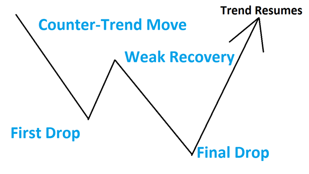
The zig-zag is unique to the future patterns to be discussed as it is a sharp correction. This three-wave move often develops early in the trend. The clear sign that a zig-zag is in play is if the second move, in the direction of the prior trend, is very weak. If it’s very weak and another move against the trend develops, we can look for the end of that move to help us enter the trend.
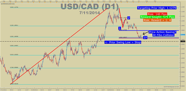
Setting Stops & Profit Targets
There are three ways we can identify a zig-zag and additionally, use that information to enter back in the direction of the prior trend.
- Look for the common sharp counter-trend three wave-moves
- Apply Fibonacci Retracements to see if the exhaustion is at a Fibonacci Collision
- Find price-action indecision at the end point that allows you to enter with a good risk: reward
Setting a stop is relatively easy, and so is setting a profit target. The stop can and should be placed below the prior swing low in an uptrend or prior swing high in a downtrend. You can choose one of two profit targets depending on your risk tolerance.
Learn Forex: Risk: Reward Is the Focus of Entries on Corrections
The conservative profit target is the prior turning point or recent high in an uptrend. If the trend truly does continue, then you will likely get out early but that’s OK as you saw an edge and were able to take money out of the market because of it. This is also a good methodology in a range-bound market.
The other option is to trade with only a trailing stop so that if the trend really does take off, you can try and ride it as long as possible. In a low volatility market this isn’t as favorable as true breakouts are hard to be sustained. However, there are always the few moves, like USDCAD or GBPUSD that defy the common patterns and a trailing stop is just the ticket.
Closing Thoughts
Because the 3-wave sharp correction happens at the beginning of the trend, when you recognize a potential entry, you should have a great risk: reward on your trade. Because we’re putting our stop below the prior low, we’re likely to be involved in the resumption of the prior trend or be alerted, through being stopped out, that a major reversal could be underway.
Happy Trading!
---Written by Tyler Yell, Trading Instructor
More...


 Reply With Quote
Bookmarks