Page 4 of 10 FirstFirst ... 2 3 4 5 6 ... LastLast
Results 31 to 40 of 91
Like Tree1Likes

How to Build and Trade Strategies

This is a discussion on How to Build and Trade Strategies within the Trading Systems forums, part of the Trading Forum category; Talking Points: While short-term trading is attractive, it can also be dangerous. Short-term traders will often exercise poor risk management, ...


  1. #31
    member ForeCastle's Avatar
    Join Date
    Apr 2013
    Posts
    1,077
    Blog Entries
    236

    How to Trade Short-Term (Day-Trade)

    Talking Points:

    • While short-term trading is attractive, it can also be dangerous.
    • Short-term traders will often exercise poor risk management, and this can have very negative consequences.
    • We share a strategy that can be used to trade short-term momentum with a focus on risk.


    For every 10 traders that come to markets, at least 7 of them want to ‘day-trade,’ or as we call it in the forex market, ‘scalp.’ Even though many of these traders are still learning the market or are very new to trading, they know they want to embark on short-term trading.

    The rationale behind this desire makes sense. After all, for most things in life the biggest rewards are for the hardest workers; those exhibiting the utmost of control and discipline long enough to properly implement their plan or strategy.

    But trading is much different in the fact that this ‘greater control’ that might be offered by short-term time frames introduces other, more difficult variables into the equation of a trader’s success.

    Many of the reasons that traders lose money become even more difficult to contend with when ‘scalping’ or ‘day-trading.’ And if these traders are making other mistakes, such as using too much leverage or inappropriate strategy selection that top trading mistake can become even more problematic.

    So, first and foremost before we get into the process of short-term trading, I want to specify that this is often the most difficult way for new traders to get started. Preferably, new traders will start with longer-term charts and approaches that may be more forgiving, and as they gain experience and comfort they can then elect to move into faster time frames.

    The Biggest Challenge of Short-Term Trading

    The biggest challenge of short-term trading is the same as the Top Trading Mistake. Too few traders looking to scalp actually do so correctly, under the incorrect presumption that trading on really short-term charts gives them enough control to trade without stops
    While keeping your finger on the trigger may give you more control, it means absolutely nothing if prices gap against your position or if a really big piece of news comes out that completely de-rails your trading plan. So, even though you may be watching price action on a five or fifteen-minute chart, protective stops are still needed.

    Further to this point, traders need to be able to focus on winning more when they are right than they lose when they are wrong. To put this another way, just because one is trading very short-term, it doesn’t mean that they can ignore The Number One Mistake Forex Traders Make.

    This can be a huge challenge on really short-term charts where near-term price movements are unpredictable. But it’s not impossible. In this strategy, I’ll attempt to show you a way to do this.

    An additional concern is variance. Per statistical analysis, the less information that is being analyzed in a data set, the less ‘reliable’ that information becomes. If we’re looking at longer-term charts, such as the daily or the weekly charts, quite a bit of information is going into the formation of each individual candle. On a very short-term chart, the opposite is true. Significantly less information goes into each candle, and thereby each candle is less reliable as a forecast of future candle formations.

    The Strategy

    With all of the above being said, trading on short-term charts is still possible. It just requires that traders utilize even more control and discipline over their trading approaches and risk management. For new traders that often struggle with risk management, or staying disciplined; the results can be disastrous. But if those boxes are checked, traders can look to exert the upmost of control over their approach with shorter time frames.

    But just because we’re trading on shorter-term charts, does that mean we want the entirety of our analysis to be performed on those time frames? Absolutely not. We can still incorporate analysis from longer time frames into our approaches in an effort to get the best probabilities of success.

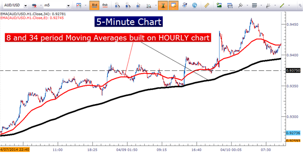
    The indicators that I add are the 8 and 34 period exponential moving averages, based on the hourly chart but plotted on the 5-minute chart (shown below).

    Multiple time frame analysis can help traders see the ‘bigger picture’


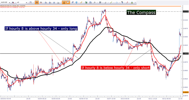
    These indicators act as a compass for the strategy, helping to see what’s taking place with a longer-term time horizon. If the faster 8 period moving average (based on the hourly chart) is above the slower 34 period moving average (also based on the hourly chart), then the strategy is looking to go long, and to only go long. As long as the hourly 8 period EMA is above the hourly 34 period EMA, only buy positions are entertained.

    The hourly moving averages work like a compass, showing traders which direction to trade the trend


    Once the trend has been identified, and the bias has been obtained, the trader can then look for entries in the direction of that trend; looking for momentum to continue on the 5-minute chart as it has been displayed by our hourly-moving averages.
    And when looking to buy, we ideally want to ‘buy low’ or ‘sell high.’ So, just because the trend is up and we’re looking to buy, it doesn’t mean we want to blindly do so. We still need a ‘trigger’ for the position, and for this, we can incorporate another exponential moving average.

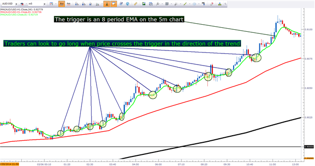
    The trigger for this strategy is another 8 period exponential moving average, but this one is built on the shorter-term five-minute chart.

    When price crosses the 8-period five-minute EMA in the direction of the trend, the trader can look to buy in anticipation of the ‘bigger-picture’ trend coming back in force.

    The ‘trigger’ in the strategy is when price crosses the 8-period five-minute EMA in the direction of the trend


    The large benefit behind the strategy is that just by the very act of price moving in the trend-side direction over the shorter-term EMA, traders are buying or selling short-term retracements in the direction of the momentum.

    Risk Management

    The most attractive part of the strategy is that it allows for traders to ‘buy cheaply’ in anticipation of bullish momentum, or to ‘sell expensively’ in anticipation of bearish momentum.

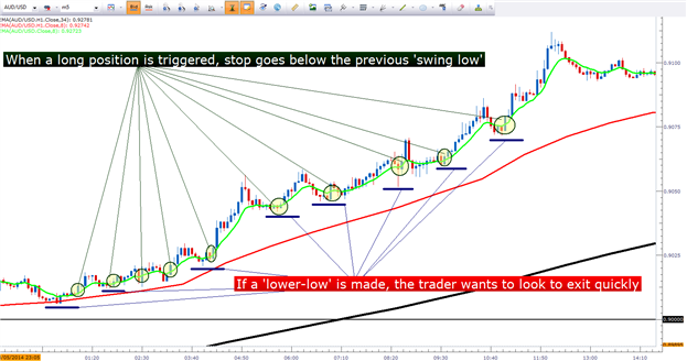
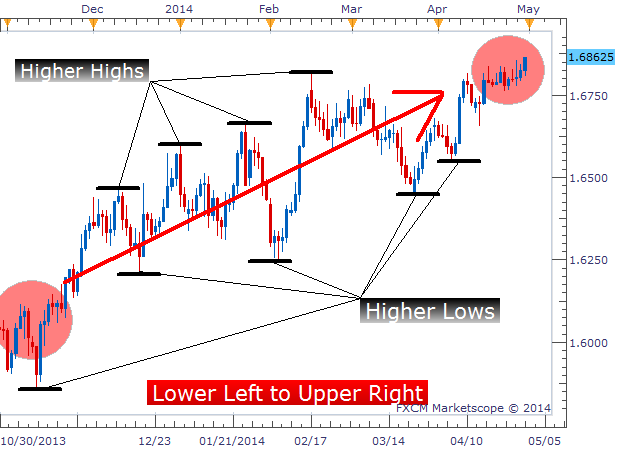
    When prices make those short-term retracements, they create swings in price action. And per price action logic, of up-trends making ‘higher-highs’ and ‘higher-lows,’ traders can look to place the stop for their long position below the previous ‘higher-low’ so that if the up-trend doesn’t continue – the trader can exit the position for a minimal loss.

    Stops for long positions go below the prior period’s opposing-side swing


    In the case of short positions, traders would want to look to place stops for short positions above the previous ‘lower-high,’ so that if the down-trend does not continue, the short position could be closed in an effort of mitigating the damage as much as possible.
    In my opinion, this is the most attractive part of this type of strategy. It allows traders to attempt to avoid The Number One Mistake that Forex Traders Make even though very short-term charts are being used to trigger positions.

    If momentum does continue in the trend-side direction, the trader could be in a very attractive position as prices continue to move in their favor.

    Position Management

    If the trend does continue, should the trader just sit on their limit order and wait for the sound of the cash register to ‘cha-ching?’
    No way. When trading on short-term charts, things can change VERY quickly, and it’s the day-trader’s job to manage that risk.
    When the position gets in the money by the amount of the initial stop (a 1-to-1 risk-to-reward ratio), the trader can look to move the stop to break-even so that, worst-case scenario should prices and momentum reverse, the trader puts themselves in a position to avoid taking a loss.

    At this point, the trader can also begin ‘scaling out’ of the position. Since a 1-to-1 risk-to-reward has been realized, the trader is actively attempting to avoid The Top Trading Mistake; and should momentum continue in the trend-side direction, the trader stands to profit considerably more.

    As prices continue in the direction of the trader’s position, additional pieces of the trade can be closed or ‘scaled out’ as prices move in their favor.

    The goal is to get the ‘average out’ from the strategy as large as possible, and if momentum is to continue, this strategy can allow the trader to do just that.

    After the stop has been moved to break-even, and the initial risk is removed from the position; traders can even look to add-to the trade with new positions or new lots in an attempt to build a larger position with a significantly smaller amount of risk.

    --- Written by James Stanley

    More...

  2. #32
    member ForeCastle's Avatar
    Join Date
    Apr 2013
    Posts
    1,077
    Blog Entries
    236

    Forex Education: Old Resistance Turned New Support

    Talking Points:

    • One common trading tip is using broken resistance as new support
    • AUD/JPY offers a better opportunity because of confluence of support near the same price zone
    • USD/CNH is retesting old resistance turned new support, but that retracement isn’t deep enough for a good risk-to-reward ratio


    Technical traders would suggest that identifying levels of support or resistance is a foundation to which a forex trading strategy is built upon. As a result, technical traders spend many hours identifying levels of support and resistance on a chart to trade from.

    Newer traders are intrigued by the ability to identify areas of buying and selling pressure on a chart. These levels of support and resistance can act like a floor (support) or ceiling (resistance) for prices. Eventually, these levels will break which offers up a new trading opportunity.
    Today, we will look at two examples of resistance and how it acts like new support when broken. In the illustrations used, we will also see how one of the examples presents a stronger opportunity than the second example. Let’s get started!

    AUD/JPY Finds Confluence of Support

    The first example we’ll look at today is the chart that presents the better opportunity of the two illustrations. This is because we have a confluence of support near the same price level. Not only has the old resistance turned new support, but we also have a support trend line passing through the same area. This is providing an extra layer of support that makes it more difficult for prices to push through.

    AUD/JPY Bounces at Old Resistance


    On the chart above, we see the AUD/JPY found resistance near the same price level in November 2013 and March 2014 near 94.50. Prices did eventually pierce this resistance level of 94.50 and broke higher. Traders who missed the initial break can wait for prices to return to the point of breakout. In this case, traders can wait for prices to return to 94.50 and consider a long position.

    In addition to this old resistance acting like new support, there is a support trend line converging upon the same price zone. This provides an added layer of confirmation on the trade that prices are likely to be supported and bounce. As a trader, give me good opportunities at good risk to reward ratios and I’ll be a happy camper.

    In this instance, traders could look to initiate a long position near 94.50 placing their stop loss just below the recent swing low (near 94.15). The first target would be the area near the previous highs of 96.00.

    USD/CNH Retraces to Old Resistance

    The second example is similar in that prices have retraced to an old resistance level. However, the second example is not as strong of a trading opportunity because we don’t have the added confirmation of another support level in the area.

    Chinese Yuan near Old Resistance


    The second illustration is for the USD/CNH.

    As we can see above, the two blue arrows represent areas of former resistance that may act like new support. Prices have sold off and are near that level of support at 6.2200 - 6.2225. It is possible we will see a reaction higher, though I wouldn’t expect the bounce to materialize into anything significant.

    That is because this level of support is NOT as strong as the AUD/JPY illustration. When applying the Fibonacci retracement levels to the chart, prices have yet to retrace 23.6% which is considered the minimum retracement of a healthy uptrend. Therefore, we need to look to lower levels of support as being our stronger levels of support.

    Therefore, look for the 38.2% retracement level near 6.17 to provide more meaningful support. At that point we can implement a “buy the dip” strategy.

    ---Written by Jeremy Wagner, Head Trading Instructor, DailyFX

    More...

  3. #33
    member ForeCastle's Avatar
    Join Date
    Apr 2013
    Posts
    1,077
    Blog Entries
    236

    2 Methods to More Patient Trading

    Talking Points:

    • One common mistake in trendless markets is impatience
    • Use conservative amounts of leverage even though market movements are slow
    • Analyze longer term chart patterns for perspective and bias

    If you hang around trading communities long enough, you’ll hear the wiser traders encouraging the newer traders about trading with patience and removing emotions.

    It sounds simple, especially if you are practicing with a demo account. However, see what happens to your patience when your money is on the line!

    A few weeks ago, we covered three common mistakes traders make during trendless markets and how to correct them. Over the next few minutes, I want to expand on the third mistake noted in that piece to help equip you with two actionable methods that can promote more patient trading.

    One common mistake of traders during trendless markets is that they become impatient and close their trades prior to the stop loss or target being reached. During trendless markets, patterns and waves are slower to develop which breeds the impatience we feel.
    To balance that impatience, practice these two methods below.

    “Remember the clever speculator is always patient and has a reserve of cash.” Jesse Livermore


    Use Conservative Amounts of Leverage

    We assume that trades which have historically reached their profit targets quickly should continue indefinitely into the future. Therefore, if prices aren’t hitting their targets quickly, it must obviously not be a good trade so we exit prematurely.

    This impatience is in part due to expecting the next trade to be a big home run. As a result, we’ll place a trade size a little larger than normal so as to squeeze a little extra juice out of the trade in case it goes nowhere. However, during this process, the trader ends up risking a significant portion of their account on the outcome of that one trade.

    Remember, a 25% loss requires a 33% return to get back to break even. If a 25% loss in a fast moving market is difficult enough to overcome, imagine how challenging it would be to overcome a 25% loss in a slow moving market. Therefore, de-emphasize each trade and think of the next trade simply as the first of ten trades rather than the next homerun.

    You can reduce the emphasis by implementing less than 10x effective leverage. Effective leverage is simply taking the total notional trade size and dividing it by your account size. The result will indicate how many times you have your equity levered. According to our research, we recommend implementing less than ten times effective leverage.

    Incorporating smaller trade sizes and less leverage will alleviate the stress of having to produce a profitable trade. As a result, you’ll be more likely to let the trade develop and let the trade evolve in the way the patterns indicate.

    Analyze Longer Term Patterns

    Another way to become more patient is to remember what the longer term chart patterns are suggesting.
    Recently, I had been trading the USD/MXN extensively and the movement was quite choppy. It had been a while since I stepped back to review the daily chart. Since it had been several months, the pattern on the daily chart cleared up which affected my near term bias on the trades.

    Sometimes, we can get caught up in the minutia of the day to day. Then, we forget what the longer term patterns are suggesting and lose that perspective in trading.

    That is the benefit you get with longer term chart analysis. Longer charts help you develop a bias of direction. With each trade you make, there should be some method of determining a bias.

    For example, trend traders look at the longer term trend and filter their trades accordingly. Range traders will see the longer term levels of support and resistance and make buying decisions near support and selling decisions near resistance.
    The point is that the market tries to lull us to sleep, yet the longer term patterns are still playing out. What better time is there to analyze charts than while the markets are slow!

    Learn Forex: USD/CNH Daily Chart


    There are several good longer term patterns exhibiting the potential for something big to happen. Keep an eye on GBP/AUD, USDOLLAR, AUD/NZD and Silver.

    In summary, train yourself to be more patient by utilizing less than ten times effective leverage and occasionally reviewing longer term charts for perspective.

    Good luck and happy trading!

    ---Written by Jeremy Wagner, Head Trading Instructor, DailyFX

    More...

  4. #34
    member ForeCastle's Avatar
    Join Date
    Apr 2013
    Posts
    1,077
    Blog Entries
    236

    The More Intelligent Trailing Stop

    Talking Points:

    • Trailing Stops can reduce risk but increase the chances of being stopped out prematurely.
    • Manually trailing our stops each time there is a new swing high/low reduces this whipsaw effect.
    • An Asymmetrical Fractal can provide guidance on when to move our stop.


    During my simple strategy webinars, traders often ask me if I use trailing stops. When I tell them that I manually trail my stops, it is usually followed by several seconds of silence. It’s not that I don’t think people can be successful with traditional trailing stops (there are many successful traders that do), but for me personally, I like to set my stops around support and resistance levels to reduce my odds of getting stopped out.

    This article will discuss the issue I have with traditional trailing stops, how I personally trail my own stops, and a handy tool to make this method extremely simple to follow.

    The Flaw in Trailing Stops

    Trailing stops are a more advanced type of stop loss order that adjusts itself to a more favorable rate as a trade moves in our favor. The result is a reduced stop loss (reducing risk) that is based solely on how price moves. It is at that moment that a traditional trailing stop shows its flaw. The stop moves to a level based on how far a trade moves in our favor, rather than moving based on key price levels. All support and resistance analysis previously performed is thrown out the window as our stop moves freely to a random level X pips away from the currency pair’s high water mark.

    Therefore our stop we set beyond the most recent swing low will suddenly move to a level above the swing low and be at much greater risk of being hit by a sudden downward whipsaw.

    Learn Forex: Trailing Stop Getting Whipsawed on USD/CNH


    Manual Trailing Stop

    So what can we do about trailing stops’ tendency of getting stopped out too early, but still have the benefits of reducing our risk during the life of our trades? The secret is in manually trailing our stop losses ourselves, always basing our stops around support and resistance levels along the way. A rare example of having your cake and eating it too. Let’s take a look.

    Learn Forex: Manual Trailing Stop in an Uptrend


    The image above shows the same trade we placed on the USD/CNH, but with much better results. Rather than using a traditional trailing stop that blindly moved up as price moved up, we moved our stop only when a new swing low was created. We set our stop below each new swing low as price progressed and were able to ride this monster uptrend 1500 pips before being stopped out.
    It can take some time to be able to “eyeball” significant swing highs and lows and know exactly when a stop should be moved. Therefore, try out this handy tool that does all the hard work for us (see below).

    The Asymmetrical Fractal

    A fractal is a tool that draws an arrow on each candle that’s highest price is higher than the high of the two candles to the left and two candles to the right. It also draws arrows on each candle that’s lowest price is lower than the low of the two candles to the left and two candles to the right. It can be used to note potential turning points in the market, or in this case, can be used to identify swing highs and swing lows that we can base our stop off of.

    Some settings will create less fractals than the traditional version due to the stipulation that the candle’s high or low price must be higher or lower than the previous 5 candles and the following 9 candles. Now that we see the asymmetric fractals on our charts, we can see their value immediately. Each time we see a fractal, that is a level where we could manually move our stop since it is a significant swing high or swing low. I’ve overlaid our fractals on to our USD/CNH chart used earlier to show how our manual trailing stop moved almost 100% in sync with the fractals created over the same period:


    The Buck Stops Where?

    Hopefully, this article has given us a better way to trail our stops. We always want our stop to be beyond the most recent swing high or swing low, and the asymmetric fractals can help identify those levels.

    Good trading!

    ---Written by Rob Pasche

    More...

  5. #35
    member ForeCastle's Avatar
    Join Date
    Apr 2013
    Posts
    1,077
    Blog Entries
    236

    A Quicker Trade Signal Using MACD

    Talking Points:

    • The MACD and Signal line crossover gives traditional buy/sell signals.
    • Histogram is the difference between the MACD and Signal line.
    • We can enter when Histogram begins to get smaller rather than wait for a cross.


    Most technical traders have experience using the more popular oscillators, RSI, CCI, and MACD, etc. But many traders I’ve taught are not aware of the alternative way to use the MACD. In this article we will discuss how to use MACD’s histogram to open trades and show how in many cases we can get a quicker entry than the traditional MACD method.

    What Does the Histogram Represent?

    The green histogram or “bar chart” included in the background of the MACD displays the difference between the MACD and Signal line. When the MACD is above the Signal line, the bar is positive. When the MACD is below the Signal line, the bar is negative. The actual height of the bar is the difference between the MACD and signal line itself.

    MACD’s Histogram Construction


    The chart above shows what the Histogram represents. The first label shows how the MACD is higher than the Signal line. This creates a positive green bar that has a height equal to the difference of the two lines. The second example the MACD is below the Signal line. This creates a negative green bar that has a height equal to the difference between the two lines. We can also see that when the Blue and Red lines cross, the histogram flips from one side to the other.

    How to Enter Based On the Histogram

    So how can we read the histogram to generate trade signals? We first want to track the histogram as it moves away from the zero line, in other words, track it as its bars grow larger. The actual signal comes when the histogram no longer gets larger and produces a smaller bar. Once the histogram prints a smaller bar, we look to trade in the direction of the histogram’s decline. We can see an example of this in the chart below:

    MACD Histogram Entry Logic


    The Sell signal on the left was created by four growing bars in a row followed by a fifth bar that closed smaller. Five bars later, we see the MACD line crossing below the Signal line which is a traditional MACD signal. This later signal would have missed a majority of the move that the Histogram signal would have caught. Therefore, using the histogram as a signal can earn us a greater number of pips.

    The Buy signal on the right is a similar story. We saw four bars growing consecutively until a 5th bar was created that equaled the 4th. We want to wait until a bar is smaller, so the trigger would have been presented after the 6th bar closed. This buy trade came several bars before the MACD/Signal cross and gave us a better entry as well.
    Once we are in the trade, we can use sound Money Management to close out the trade appropriately.

    And The Rest is Histogram

    This entry strategy is fairly straight forward and can quickly be adopted by a technical trader.

    Good trading!
    ---Written by Rob Pasche

    More...

  6. #36
    member ForeCastle's Avatar
    Join Date
    Apr 2013
    Posts
    1,077
    Blog Entries
    236

    Save Money by Getting Better Trade Entries

    Talking Points:

    • Learn how to ‘eyeball’ bullish and bearish trends.
    • Trade pullbacks as identified by the Slow Stochastic.
    • Set stops beyond closest support/resistance and set limits twice as far.


    The Slow Stochastic is often an indicator I teach in our “Simple Trading Strategies” series and for good reason. It’s simple to understand, gives very clear trading signals, and can often lead to profitable trades. But something I don’t have time to do during those 30 minute long sessions is talk about market conditions and how that can play a role in whether a strategy is successful or not.

    Today, we will cover how to identify trending markets and then apply the Slow Stochastic to get into trades during pullbacks.

    The Trend is Your Friend

    Every trader has heard the phrase, “The trend is your friend.” This phrase describes traders that look for instruments moving consistently up or down and then trade in the same direction as the trend. If the trend continues, trend traders make money. If the trend reverses, trend traders lose money. In principle, this is easy, but in practice it is a little more difficult.

    Properly identifying trends takes practice. We need to be confident in what constitutes a trend and what invalidates a potential trend. So the two things I look for are:

    • A general move from lower left to upper right or from upper left to lower right.
    • Higher swing highs and higher swing lows or lower swing highs and lower swing lows.


    The following examples show charts identified as an uptrend and a downtrend using these two rules.

    Learn Forex: Identifying an Uptrend


    Learn Forex: Identifying a Downtrend


    Using Slow Stochastic to Identify Pullbacks

    Once we identify a chart that is trending up or down, we need to add our Slow Stochastic indicator to the chart. I prefer using the settings (15, 5, 5) rather than the default (5, 3, 3). These settings slow down the indicator further and provides (in my opinion) more reliable signals. In an uptrend, we want to take any Slow Stochastic buy signal that occurs in oversold territory, below 20. (In a downtrend, we want to take any Slow Stochastic sell signal that occurs in overbought territory, above 80.)

    The image below shows a great buy entry on the GBPUSD where price was trending upward, pulled back resulting in an oversold Slow Stochastic reading, and then had a Slow Stochastic signal to buy in the direction of the upward trend.

    Learn Forex: Uptrend with Slow Stochastic Entry – GBPUSD Daily Chart


    The image above shows the same trade we placed on the USD/CNH, but with much better results. Rather than using a traditional trailing stop that blindly moved up as price moved up, we moved our stop only when a new swing low was created. We set our stop below each new swing low as price progressed and were able to ride this monster uptrend 1500 pips before being stopped out.

    It can take some time to be able to “eyeball” significant swing highs and lows and know exactly when a stop should be moved. But, there is a really handy tool that can be used to identify these levels more clearly.
    Exit Strategy

    No Strategy is complete without an exit strategy. For the trade example above, we will need to set our stop beyond the most recent swing low. I like to set my stop anywhere from 5-25 pips away from the low depending on the time frame and currency pair. With a trade size using sound money management rules.

    For our limit, I suggest using a limit that is twice the distance as our stop. This gives us a positive risk:reward ratio of 1:2 with a breakeven win rate requirement of only 33%. So as long as we are correct on 1/3rd of our trades or more, we should at least be breakeven traders using this risk:reward ratio. Both the stop and limit used for this trade can be seen below.

    Learn Forex: Downloading & Installing the Asymmetric Fractals Indicator


    Pulverizing the Pullback

    In this lesson, we discussed the importance of identifying a trend, locating pullback entries and how to manage each trade moving forward.

    Good trading!

    ---Written by Rob Pasche

    More...

  7. #37
    member ForeCastle's Avatar
    Join Date
    Apr 2013
    Posts
    1,077
    Blog Entries
    236

    The 3 Step No-Hassle Range Trading Strategy

    Talking Points:

    • Low volatility opens the door to use range trading strategies.
    • Pivot levels automatically give traders support and resistance levels to trade from.
    • Stops and limits can both be set using pivot levels.


    With the slow market conditions we have been seeing lately, trend strategies and breakout strategies have had a difficult time turning a profit. The strategies I have been running that made money from 2011-2013, have really struggled to keep their heads above water during 2014. So I’ve been on the lookout for ways to efficiently trade low volatility periods of time using range based strategies.
    Today, we are going to cover a range strategy created specifically for current market conditions we are facing.

    Step 1: Look for Low Volatility

    As mentioned above, range based strategies work best in low volatility periods of time. So, our first order of business is to find the pairs that have shown the least amount of volatility.

    Learn Forex: DailyFX Technical Analysis - Volatility


    The image above shows volatility highlighted in red. A 0% reading means a pair has shown almost no volatility while a reading of 100% means the pair has shown an extreme level of volatility. For the purposes of range trading, we recommend a reading of 25% or lower. So we need to make note of each pair with volatility below 25% before we move on to our charts.

    Step 2: Find Trade Entries Using Pivot Levels

    Pivot levels are one of the oldest forms of technical analysis. They were actually used by floor traders to easily keep track of important price levels before price charts became more readily available. Fortunately for us, we do not need to calculate these levels ourselves.

    Learn Forex: Pivot Levels


    Our chart should now look like the one above, a single gray line with multiple green lines and red lines above and below. These lines will act as our trigger for placing a trade and for setting stops and limits.

    Step 3: Entering and Exiting Using Pivot Levels

    We need to identify the lines by their proper names. The gray line is called the “pivot” and is in the middle. The green lines above are resistance levels named R1, R2, R3 and R4 with the smaller numbers closer to the pivot line. The red lines below are support levels named S1, S2, S3 and S4 with the smaller numbers closer to the pivot line. Any of these lines can cause price to bounce.

    For our entry, we are going to wait until either S1 or R1 are hit. If S1 is hit, that is a buy signal. If R1 is hit, that is a sell signal. The idea is that if markets are ranging, then they will snap back towards the mean if they move too far in one direction or the other. The chart below displays a classic buy signal when price hits S1.

    Learn Forex: Buy Trade Setup - Using Pivot Level Range Trading


    “…If S1 is hit, that is a buy signal…”

    Once the buy trade is placed, we set our stop loss at S2, with profit targets at the pivot and R1 levels.

    In a situation where price reaches the R1 first, this would trigger a sell trade with a stop loss at R2 and profit targets at the Pivot and S1. Effectively, the inverse of the chart shown above.

    Home, Home on the Range

    When using the correct tools, we can trade any market. And when it comes to trading markets with low volatility, pivot levels are an easy way to open and close range-based trades.

    Good trading!
    ---Written by Rob Pasche

    More...

  8. #38
    member ForeCastle's Avatar
    Join Date
    Apr 2013
    Posts
    1,077
    Blog Entries
    236

    Breakout on USDCHF Backed by Sentiment Shift

    Talking Points:

    • The USDCHF has broken above its price channel.
    • SSI has flipped to a negative value for the first time in a year.
    • Potential Buy trade based on technicals and sentiment.


    I wrote three weeks ago about the longstanding short trade I had on the USDCHF. Shortly after posting, the oldest trade I’ve ever held onto (49 weeks) was stopped out on what could be a reversal of a long term trend. Today, the USDCHF broke another significant level that adds more fuel to the bullish fire. Let’s look at the arguments for a USD/CHF long trade in the form of technical analysis and sentiment.

    Breakout Leading to Long-Term Reversal?

    The USDCHF has wasted little time in reversing from its low of 0.8700 up to the highs we are seeing now. It’s broken its two previous highs and has also broken out of a price channel formed from its previous swing lows (labeled in green below). The price has closed above this channel on a daily chart, which confirms the breakout. This move is what originally brought this trade idea into focus.

    Learn Forex: Daily Chart – USDCHF Long Trade Plan


    I like a Limit just below the previous high on January 21st and a stop loss that is half that distance in pips from my entry. This gives us a 1:2 risk reward ratio which follows DailyFX’s money management principles. The stop is relatively tight, but I am comfortable with that considering the USDCHF could fall almost all the way back to 0.8700 without much support in its path. I’d rather we cut this trade quickly if it begins to move against us.

    Sentiment Flipping Negative – Bullish Signal

    The other signal supporting the trade idea above is what has been going on with DailyFX’s SSI, the Speculative Sentiment Index. Sentiment has been notoriously long the USDCHF for over a year while traders tried to “pick the bottom” during the downtrend. These retail traders were in a world of hurt up until 3 weeks ago when the potential bottom was hit.

    For the last couple days however, sellers have begun to slightly outweigh buyers as price has risen. This means that long USDCHF traders are taking profit, and some traders are beginning to apply short positions looking for a move back in the direction of the long term trend. We can see in the sentiment chart below, as price has been moving higher, SSI has been moving lower and now is creeping into negative territory.

    Learn Forex: Speculative Sentiment Index (SSI) on USDCHF


    The negative sentiment level, while not extreme on its own, is important considering how long it’s been since sentiment has been negative. If we see more and more sellers enter trades on the USDCHF, this would reaffirm the USDCHF buy trade since SSI is a contrarian tool. We look to do the opposite of the retail trading crowd with the idea that there is an edge in doing so.

    The Falling Franc

    The sudden shift in the USDCHF ended my longstanding short position, but could lead to a profitable buy position if the reversal is legitimate. With a classic breakout signal and sentiment levels backing the idea, I believe it is a trade worth considering. As always, please apply your own analysis before trading and email me with your thoughts and feedback!

    Good trading!
    ---Written by Rob Pasche

    More...

  9. #39
    member ForeCastle's Avatar
    Join Date
    Apr 2013
    Posts
    1,077
    Blog Entries
    236

    Gold Presses Fibonacci Wave Relationship

    Talking Points:

    • Triangles are consolidation patterns that tend provide clean technical levels to trade from
    • Gold may be nearing a bullish reaction point that offers a trading opportunity to buy
    • Try trading gold in a practice demo account

    Gold appears to be consolidating in a sideways triangle for the past 12 months. This is a big consolidation pattern that offers some trading opportunities inside the triangle.

    Look for the yellow metal to find support over the next several days and a potential $100 rise in the price of the gold.
    The Anatomy of a Triangle

    Triangles are consolidation patterns that allow prices to trade sideways in an effort to alleviate overbought and oversold pressures. In the case of gold, it has been working its way lower for the past three years and needs to consolidate those losses, which it has been doing in the triangle pattern.


    Elliott Wave triangles are made up of five waves inside the triangle with each wave being contained inside the previous wave. In the idealized example above, notice how wave ‘B’ ends BEFORE the beginning of wave ‘A’. Notice how wave ‘C’ ends BEFORE the beginning of wave ‘B’. This continues until prices squeeze together in five waves (A-B-C-D-E) then they eventually explode.

    In the same idealized example above, it appears gold is closing in on the end of the ‘D’ wave which should yield a bounce higher in wave ‘E’.

    Gold Analysis: Bulls have Fibonacci reasons to buy


    Here is the actually price chart of goal with the green triangle labels. There are two wave relationships that point towards the end of the ‘D’ wave ending near $1235 per ounce. Both wave relationships are expressed through alternating waves having a fibonacci relationship in length.

    First, inside the green ‘D’ wave, you’ll see we have a blue a-b-c sequence. Many times, the length of wave ‘c’ will have an equality or fibonacci relationship to the length of wave ‘a’. In the case for gold, the length of blue wave ‘c’ equals blue wave ‘a’ times 61.8% at $1235 per ounce.

    Secondly, green wave ‘B’ and green wave ‘D’ are alternating waves. If you take the distance of green wave ‘B’ and multiply it by 61.8% and project it for a distance on green wave ‘D’, it yields a price target of $1235 per ounce.

    So we have two different alternating waves pointing to the same price target. This means there will likely be a reaction higher near $1235. If $1235 does fail, look to $1190-$1200 providing significant support.

    The price target to the upside in this scenario would be $1340-$1390. So there is enough room to the upside to position towards the long side of the trade.

    ---Written by Jeremy Wagner, Head Trading Instructor, DailyFX Education

    More...

  10. #40
    member ForeCastle's Avatar
    Join Date
    Apr 2013
    Posts
    1,077
    Blog Entries
    236

    Technical Patterns Show AUDUSD Risks New 2014 High

    Talking Points:
    -The Current Technical Juncture for AUDUSD
    -200-DMA Could Support Price Further
    -Price Patterns Favoring a 2014 High Is Coming

    “[Michael Marcus] taught me one other thing that is absolutely critical: You have to be willing to make mistakes regularly; there is nothing wrong with it. Michael taught me about making your best judgment, being wrong, making your next best judgment, being wrong, making your third best judgment, and then doubling your money.”
    -Bruce Kovner

    AUDUSD plays a very important role in the FX Market. First, AUDUSD is often a key proxy for the risk-on sentiment that is prevalent among G10 currencies. If AUD is bid, risk appears to be favored as AUD is a high-yielding currency and is often bought as institutional and retail investors look to be pair more in an environment that favors risk and downplays risk-avoidance. If AUD is offered / sold, risk appears to be out of favor of many traders as they look to favor a safe currency like the USD, JPY, or CHF in preference over higher-yielding AUD, NZD or EMFX crosses. In other words, markets are emotional and AUD is at the axis of the emotions.

    The Current Technical Juncture for AUDUSD

    From April 2013 to January 2014, AUD was having a hard time finding any long-term buyers. There was a strong bear-market rally from August to October, but that was overcome and AUDUSD pushed new lows not seen since 2010. Now, a similar rally to the Fall ’13 rally is at play and we’re approaching a critical point on the chart that will bring light to whether the technical edge favors the bulls or bears.

    Learn Forex: Will History Repeat


    From his chart alone, you’ll notice a few key things are at play. First, the move from the late January low of 0.8659 looks similar to the last bear-market rally that ended up in a 900 pip downtrend. Second, a trendline connecting the October ’13 top to the tops in mid-2014 are acting as resistance to the upside. However, a few factors favor the upside that could be more important and if broken with a close higher, could signal a move into 2014 highs soon.

    200-DMA Could Support Price Increases Further

    If the Forex market have any equivalent to a compass, it could very well be the 200 day moving average. In no uncertain terms, price above the 200-dma favors a further increase in price, which is common for an uptrend. Price below the 200-dma favors a further decline in price, which is common for downtrends.

    Learn Forex: 200-dma on AUDUSD


    The yellow line above denotes the 200-dma. As you can see, price is currently above the 200-dma, which favors further upside in a trending market. If you look above (click on the chart for a better view), the 200-dma acted as resistance in October 2014 and effectively capped the move before resuming the downtrend that started in January 2014. This prior reaction to the 200-dma helps us to see the 200-dma as significant and if price continues to stay above the 200-dma, then further prices should be favored.

    Price Patterns Favoring a 2014 High Is Coming

    There are two patterns unfolding that are pointing to the potential for significantly higher prices should AUDUSD close above 0.9410. The two patterns are Elliott Wave Patterns and a bullish flag. Both of these patterns could see AUDUSD targeting between 0.9695-1.000.

    Learn Forex: AUDUSD Patterns Favoring Higher Potential


    Let’s breakdown the two patterns so that you can see their trigger, stops, and targets. The trigger to enter is 0.9410 & the stop at 0.9200 is the same for both patterns. The only difference between the two are the potential targets and you can decide which you prefer based on how aggressive you want to be.

    The first pattern is the Elliott Wave Pattern that look for a 5th wave to finish a common 5-wave pattern. A common Elliott Wave target is to look for wave 5 to equal 0.618% of the total distance traveled between waves 1-3. Projected from the end of W.4 near the 200-dma around 0.9200 would take us near 0.9695.
    The second bullish pattern, known as a bull flag, which would be triggered on a break and close > 0.9410. The flag is a pattern made from a small correction after an impressive push higher that presumes another push higher. The bull flag target is based on the prior impulse distance projected from the flag low, which sits around 0.9200 bringing a target near parity of 1.0009

    Happy Trading!
    ---Written by Tyler Yell, Trading Instructor

    More...

Page 4 of 10 FirstFirst ... 2 3 4 5 6 ... LastLast

Tags for this Thread

Bookmarks

Posting Permissions

  • You may not post new threads
  • You may not post replies
  • You may not post attachments
  • You may not edit your posts
  •