Page 9 of 37 FirstFirst ... 7 8 9 10 11 19 ... LastLast
Results 81 to 90 of 369

Fine Arts News

This is a discussion on Fine Arts News within the Painting forums, part of the Fine Art category; Huguette Clark owned several apartments on Fifth Avenue, a mansion in Connecticut and a house in California, but chose to ...


  1. #81
    member Antique's Avatar
    Join Date
    Jun 2013
    Posts
    714
    Blog Entries
    578

    Eccentric Heiress' Untouched Treasures Head For The Auction Block


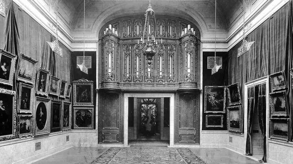
    Huguette Clark owned several apartments on Fifth Avenue, a mansion in Connecticut and a house in California, but chose to live for two decades in a hospital room. This New York City house, her childhood home, featured five art galleries. (Photo from the book Empty Mansions)

    Courtesy of Camera Craft

    She had three apartments on New York's Fifth Avenue, all filled with treasures worth millions, not to mention a mansion in Connecticut and a house in California. But the enigmatic heiress Huguette Clark lived her last 20 years in a plainly decorated hospital room — even though she wasn't sick.


    Huguette Clark poses for a photograph in her debutante days. She was 104 when she died in 2011. (Photo from the book Empty Mansions)

    It's just one of many curiosities about Clark, the late heiress to the fortune of copper magnate Sen.Andrew Williams Clark. For years, even friends and family thought she was living on Fifth Avenue. Her lavish gifts to her nurse prompted a police investigation. And now, three years after her death at age 104, Clark's artwork and antiques are heading from her abandoned apartments to Christie's auction block.

    Empty Homes Full Of Pristine Treasures


    At a preview for the auction, being held this month, the room is filled with extraordinary items collected over decades, all in perfect condition. One armchair from the 18th century is so perfectly preserved that the needlepoint colors are still brilliant.

    "The decorative arts that you see around the room here have come from the Fifth Avenue apartment where Huguette lived a fair part of her life," says Andrew McVinish, head of Private and Iconic Collections at Christie's.
    There are rare books, antiques and paintings. Christie's recently sold a Monet painting of water lilies from the Clark estate for $24 million. At one point, McVinish takes a gold-colored handbag out of a case. The paper stuffing is still in it. "Once again, never been used," he says.

    And that's symbolic of one of Clark's eccentricities. She had a mansion in Connecticut that was never occupied. Her New York apartments were kept up, empty, for more than 20 years. Paul Clark Newell, a cousin of Clark's, spoke to her over the phone for nine years while Clark was in the hospital. He, like everyone, assumed she was living on Fifth Avenue.

    She always made the calls out so no one would know where she was calling from, Newell says. He and Bill Dedman are co-authors of a book about Clark called Empty Mansions.


    The George I Walnut and Beech Wing Armchair, circa 1725, covered in 18th century gros point and petit point needlework, is one of Huguette Clark's many belongings headed to auction.

    Photo courtesy of Christie's Images Ltd. 2014

    Dedman notes that if you were in your mid-80s, alone with three apartments filled with paintings worth millions, you might well feel unsafe.

    "She had much more society in the hospital than she had at home," he says. "She had people visiting her, she had people to take care of her."

    Generosity That Raised Red Flags


    Clark gave her nurse $30 million in gifts over time, and put her lawyer and accountant in the will. This raised so many red flags that the Manhattan district attorney's office began to investigate. The assumption was that Clark was yet another example of an elderly, wealthy woman preyed on by lawyers, accountants and caretakers. But the investigation closed with no charges.

    Dedman, who first reported the story, says everyone reasonably assumed something was amiss, but that wasn't the case.

    "This was an eccentric, capable, lucid, artistic, generous woman who had enjoyed the trappings of wealth," Dedman says. "She's interested in music and painting, and Japanese history, and building little castles, and her doll collection, and being generous to the people she knows, and even to strangers. That was the life that she wanted and that she lived."


    The view from Clark's last regular hospital room at Beth Israel Medical Center in New York City. (Photo from the book Empty Mansions)

    Before Clark's death, the hospital where she had lived for so many years lobbied her for money for a building. In the end she gave the hospital only $1 million. What she did want was to create an art institute in her mansion in Santa Barbara — and that will become a reality.

    Meryl Gordon, who wrote about the Astor family scandal in Mrs. Astor Regrets, just wrote a book about Clark, The Phantom of Fifth Avenue. She interviewed Marie Pompei, a nurse who became a friend of Clark's after she no longer worked for her. Pompei saw the heiress about a month before Clark died in 2011.

    "And they were singing in the hospital; they were telling jokes," Gordon says. "[Clark] really was all there until she went into a coma and died. She knew what she wanted; she knew what she didn't want, but she also had a sense of humor."

    Dedman and Gordon paint a very different portrait of the reclusive heiress in her final years — quite different from the one many people had imagined.


    More...

  2. #82
    member Antique's Avatar
    Join Date
    Jun 2013
    Posts
    714
    Blog Entries
    578

    Man Emerges From Picasso's Painting 'The Blue Room'


    Scientists and art experts found a hidden painting beneath one of Picasso's first masterpieces, The Blue Room, thanks to advances in infrared technology. Here, associate conservator Patricia Favero of The Phillips Collection points to a detail in the image.

    Evan Vucci/AP

    A bearded man lurks beneath the surface of a famous Picasso painting. That's the image brought to us by curators who used new technology to find details of a portrait the artist painted over when he created his famous The Blue Room in 1901.

    The painting's surface depicts a scene in Pablo Picasso's studio in Paris, with a woman bathing between a window and a table. But a different scene lies underneath, as infrared and other analysis shows a man in a bow tie staring out from the canvas, his head propped on his hand.

    The Blue Room
    is at The Phillips Collection in Washington, D.C. Researchers from the museum and other institutions recently showed the AP the newly uncovered details of what lies beneath the painting.


    The Blue Room, one of Pablo Picasso's first masterpieces, sits in a vertical position in front of an infared camera at the Phillips Collection in Washington on Tuesday.

    "It's really one of those moments that really makes what you do special," Phillips conservator Patricia Favero tells the AP. "The second reaction was, 'Well, who is it?' We're still working on answering that question."
    The likely reason the canvas was reused, curators say, was that Picasso didn't have the money to use a new canvas for each new work early in his career.

    The AP says this isn't the first time a different work has been found beneath a Picasso:
    "A technical analysis of La Vie at the Cleveland Museum of Art revealed Picasso significantly reworked the painting's composition. And conservators found a portrait of a mustached man beneath Picasso's painting Woman Ironing at the Guggenheim Museum in Manhattan."

    More...

  3. #83
    member Antique's Avatar
    Join Date
    Jun 2013
    Posts
    714
    Blog Entries
    578

    Never Tell Them The Odds: Cities Vie To Host 'Star Wars' Collection


    While cities are still competing for the not yet built Lucas Cultural Arts Museum, parts of the collection are already on display. The "Star Wars Identities" traveling exhibition, currently at the Cite du Cinema in Saint-Denis, France, features 200 objects from George Lucas' collection — including the costumes of Chewbacca, Han Solo and Princess Leia Organa.

    A short time ago, in a city not far away, Star Wars creator George Lucas decided to build a museum to house his movie memorabilia and his art collection.

    There's just one looming question: Where should it go?

    Lucas says he'll spend $300 million of his own money to build the proposed Lucas Cultural Arts Museum and will provide a $400 million endowment after his death. In addition to holding Skywalker artifacts galore, the museum would also host Lucas' private art collection, featuring works by Norman Rockwell and N.C. Wyeth, among others.

    But after Lucas' original planned location fell through, it's not clear where the museum will be located. San Francisco and Chicago are both trying to win the right to host the museum, and Los Angeles just entered the fray as well.


    More...

  4. #84
    member Antique's Avatar
    Join Date
    Jun 2013
    Posts
    714
    Blog Entries
    578

    Kandinsky On A Plate: Art-Inspired Salad Just Tastes Better


    Kandinsky's "Painting no. 201," on the left, was the inspiration for the salad on the right, which was used to test diners' appreciation of the dish.
    Museum of Modern Art; Crossmodal Research Laboratory

    We eat first with our eyes. When strawberries are perfectly red, they seem to taste sweeter. When chicken is painted blue, it's disturbing. The ancient Romans understood that, and certainly today's top chefs exploit it when they plate their food.

    Some plating practices are ethnic, others trendy. A Japanese dish would not appeal if a large chunk of meat was set on top of a heap of starch in the center of the plate, as is common practice with French food. And then there are chef-y flourishes like towering vertical stacks, swirly sauces and the fried sprigs of rosemary sticking out of a sandwich.

    So how far should chefs and stylists really go to win over diners? Perhaps even further.
    Recently, some experimental psychologists at the University of Oxford decided to see what impact a plate of salad arranged like an abstract painting would have on 60 diners' perception of the food.

    One group of diners was offered a salad arranged like Wassily Kandinsky's "Painting number 201." Another group was given a salad featuring broccoli sprouts, Portobello mushroom slices and snow peas lined up in neat rows. The last group was offered a typical pile of salad arranged in the middle of a plate. Each salad had identical ingredients, dressing and condiments.

    The Kandinsky salad was rated the best — by an 18 percent margin over the other two presentations. Most importantly for restaurateurs, diners were willing to pay twice as much – both before and after eating it. (See the breakdowns in ratings in this bar graph.)


    The components of the salad used in the Oxford study (left), and the pile of salad given to the third group of participants.
    Crossmodal Research Laboratory

    Charles Michel, who is the chef in residence at the Oxford Crossmodal Research Lab and the lead author of the study, tells The Salt he chose Kandinsky's work for "the specific association of colors and movement." His chef's mind saw a salad, particularly the mushroom shape in the top left corner, and the experiment took shape.
    "It's not so much about food copying a work of art in particular, but rather using artistic inspiration, or simply having an artistic sensitivity when plating food — as most chefs actually do," he says.

    The diners were not told that the Kandinsky-esque salad was designed to look like a painting. Still, the study shows that "diners intuitively attribute an artistic value to the food, find it more complex and like it more" when presented this way, the study's authors, Michel and his co-authors write in the paper.

    Why the diners thought the painting-like plates were more appealing is trickier to parse out. They may have identified appealing patterns of color and shape, or, the artistic plate may have "implicitly suggested a connotation of higher value (or effort) through the visual display, value that might have helped to deliver a more pleasurable eating experience," the study says.

    The "Taste of Kandinsky" study was published this month in the journal Flavour.
    "I hope certain cooks can get inspired by this, and openly connect culinary creation to a more artistic act," Michel says.

    So all you wanna-be chefs and food stylists, try imitating some art for your next food photo shoot. Tweet us your pictures to @NPRFood. Don't forget to tell us what painting you're modeling and use the hashtag #NPRfineartfood. We'll post a roundup of the best next week.

    More...

  5. #85
    member Antique's Avatar
    Join Date
    Jun 2013
    Posts
    714
    Blog Entries
    578

    A Modern Twist On Mexican Tradition Hits The Runway


    To the left is the fiesta huipil of the Chinantla region of northern Oaxaca, while a Carla Fernández-designed rebozo, hand-embroidered by indigenous Otomii artisans with an iguana motif, is modeled on the right. The Isabella Stewart Gardner Museum in Boston is exhibiting Fernández's work this summer.

    Eunice Adorno/Ramiro Chaves/Courtesy of Isabella Stewart Gardner Museum

    In a small shed in Tenancingo, Mexico, partly open to the sky, about a half-dozen men stand behind huge wooden looms. They pedal side-by-side, their churning feet making a beautiful harmony as they craft handmade rebozos.
    Rebozos, long rectangular shawls that came into style in Mexico in the 16th century, and the huipil, a woven and embroidered blouse or dress of pre-Columbian origin, are the main elements of Mexican traditional dress.


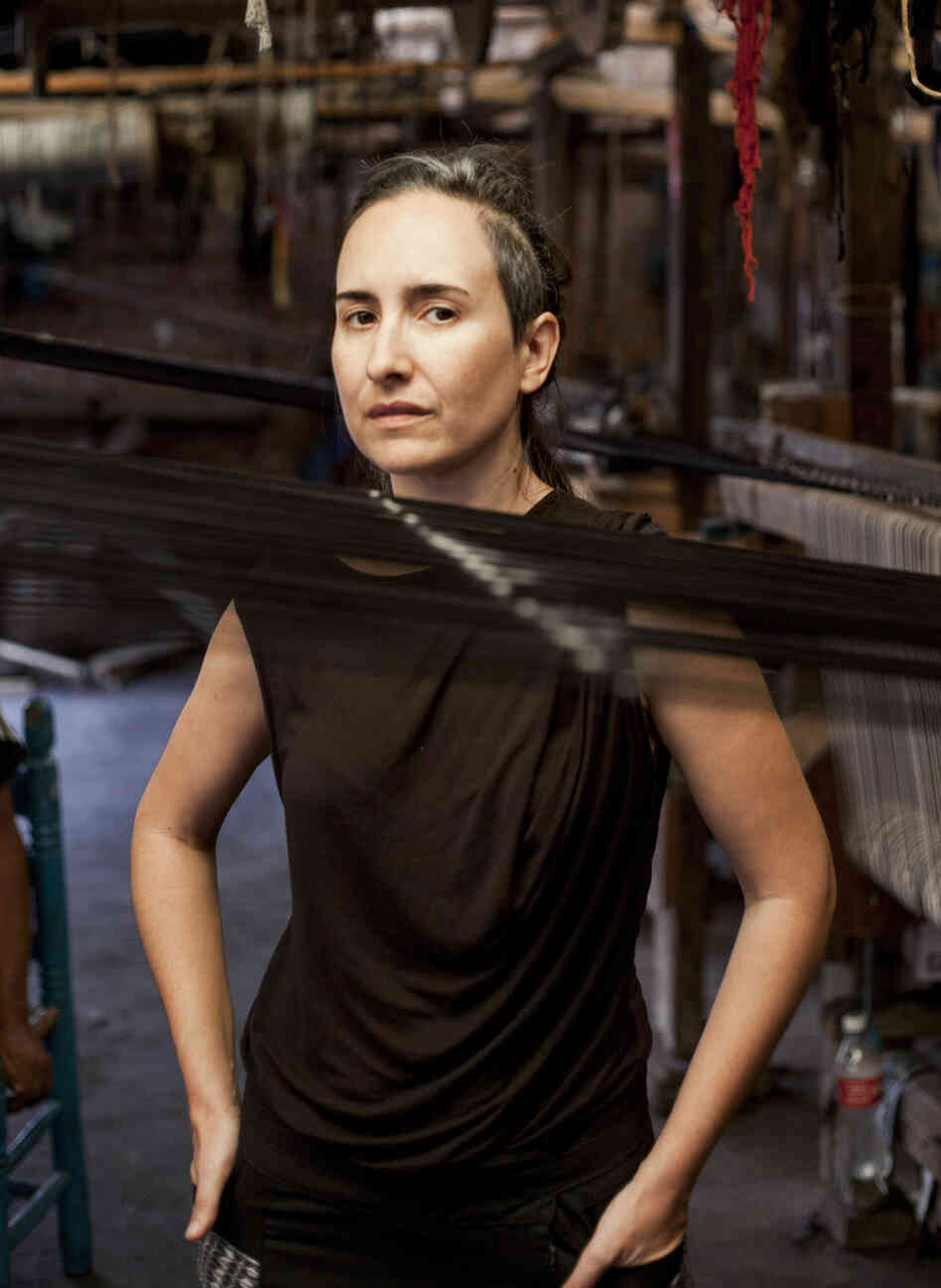
    Mexican designer Carla Fernández visits a rebozo workshop in Tenancingo, Mexico. In her work, Fernández uses fabrics made by weavers from across Mexico.

    Today rebozos and huipiles bridge the past and future of Mexican garments. They're being reinterpreted by designers like Carla Fernández, who takes these handmade textiles and manipulates them into something contemporary.

    The tiny rural workshop in Tenancingo represents one thread of Fernández's elaborate supply chain, one that loops from Mexico's plains and mountains to runways in Tokyo and Amsterdam.

    A Few Cuts, Then Transformation


    On a visit to the weavers, the designer unfurls a blue-and-white fringed rebozo, intricately loomed into a tight herringbone pattern. It's nearly 8 feet long.

    "We just make these cuts, and put these two sleeves," Fernández explains. "And you can use it as a vest, and then you can turn it upside down and you will see it becomes more a blouse or a sweater."

    On the body, it's chic, sculptural, edgy — but laid flat, the finished garment keeps its traditional rectangular shape.
    Fernández leaves the fringes of the rebozo intact, she says, "so you can actually see that this is all handmade."
    In fact, the rebozo is one of the most labor-intensive garments on earth. Before any looming begins, the threads are wrapped with thousands of knots and dyed, then the knots are removed — a process known as ikat.

    Mexico's rich, raw fabrics — cotton, shaggy sheep's wool or even rough ixtle from cactus fiber — attracted Fernández as a teenager. Indigenous women in remote villages wore these fabrics themselves — but the ones they sold weren't as elaborate.
    "I used to tell them, 'No, I don't want this huipil, I want one like the one you are wearing,' " Fernández says.
    Now 41, Fernández travels constantly to collaborate with indigenous weavers throughout Mexico, offering special workshops where weavers can develop new skills or learn to market old ones.


    A weaver crafts a rebozo on a traditional loom in the rebozo workshop of Don Fermín Escobar in Tenancingo, Mexico. At right, a detail from a rebozo.

    Protecting A Heritage Of Storytelling And History

    Hundreds of miles away from the rebozo workshop, in the mountains of northern Oaxaca, Fernández has been invited to the city of Tuxtepec to see if local weavers want to become her suppliers.

    The weavers here are women with long braids, wearing bright red huipiles. Some of them speak only a tonal dialect called Chinantec as they demonstrate a backstrap loom, which ties around the waist to a pole.
    Their huipiles are woven with symbols, like trees of life or creation myths of light and darkness. Traditionally, indigenous weaving tells a story.

    There's so much cultural significance attached to these garments that issues of historic racism and exploitation can't help but come up. Marta Xucunostli, a 34-year-old local activist, says that she was initially skeptical about designers like Fernández coming into indigenous areas like hers to work with weavers.

    "At the beginning ... I was like, 'Who is this designer who is coming?' Because as communities we protect ourselves," Xucunostli says. "Like back in the times of the conquerors ... giving a mirror and doing some not-fair trade."
    Xucunostli says she Googled Fernández carefully. Her caution comes from centuries of exploitation. Anthropologist Marta Turok, who specializes in Mexican textiles and helped Fernández establish fair-trade practices, can understand.
    "To be an Indian is to be at the lowest link in the chain," she says.

    'The Next Thing You Know ... Goodbye, Braids'


    The role of weaving in communities is changing. When Turok began her research decades ago, nearly all indigenous women wore huipiles.
    As more and more children assimilated and went to school, however, plaid skirts and acrylic sweaters became mandatory.
    "And the next thing you know ... goodbye, braids," Turok says. "Do you think that young girl is ever going to wear a huipil? Probably not."
    Since the Zapatista rebellion in the 1990s, the Mexican government has made some attempts at reform, including recognition of indigenous cultures.
    Turok says a critical concern in seeking new markets is whether it compromises the heritage of the artisans.
    "Once the designers came in, or the non-profits, or even the government, you created a system of dependency. The artisans became dependent on a third person," Turok says.
    "That third person could control the raw material and say, 'Here, I'll give you the raw material and I'll just pay you for your labor,' " she says. "So one of the questions is: Who is in control of the production?"


    Weavers make huipiles, a detail of which can be seen at right. Huipiles have been worn by indigenous women in Mexico and Central America since before the era of Spanish colonialism.

    Making Contacts, Placing Orders


    Fernández's answer to this question lies farther into the region called Chinantla. The road into the mountains passes cool green groves of vanilla bean orchards and trees laden with mangos.

    Fernández is on her way to meet another group of artisans — women she's not yet sure if she'll be able to work with.
    "We will try," Fernández says. "This trip is very important to us because we'll have the contacts of the weavers — and then we will get back to the city and reach them through email, through phones, and then we'll know exactly what we can propose."
    In the tiny community of San Pedro Ixcatlán, Fernández's car pulls up outside the hilltop home of Rosina Sarmiento, a 65-year-old artisan.

    Inside, Sarmiento opens a cabinet overflowing with bright, beautifully embroidered fabrics created in the Mazateca style.
    They're covered in birds and flowers. Fernández checks out bedspreads and tablecloths, holding them up against her body.
    "The embroidery is so fine that it looks painted," Fernández says. "If you see it from far away, you don't know if it's a print. And then you come very close and then you see that it's amazingly embroidered."
    If Sarmiento decides she'd like to work with Fernández, Fernández will pay half up front and half on delivery. Ultimately, one of Sarmiento's hand-embroidered flowers or parrots might end up on shawls, ponchos or dresses in one of Fernández's two Mexico City boutiques.

    Old Traditions, New Versatility


    At left, a Quetzalcoatl feathered-serpent fiesta huipil. On the right, Mayan artisans hand-embroidered an armadillo onto this linen dress from Carla Fernández's Mayalands collection. The shape of Fernández's dress is inspired by the traditional huipil.

    Fernández is prepared for another question as well: Is this use of indigenous weaving traditional? "What [the weavers] do for the tourists is not traditional, either, you know?" Fernández says. "These are the communities that want to do new designs — those are the ones we work with."

    Increasingly, younger indigenous women wielding cell phones and business cards seem happy to have their handiwork on the world stage.

    "They know how to do backstrap loom. Who in the world, like young people, know[s] how to do backstrap loom? Very few," Fernández says. "But it's something that makes you very unique, like those things that your grandparents taught you. I think the new generations are pretty into it."

    Milagros Ortega, 27, is part of the next generation, and a full-time weaver. A backstrap loom of red thread is strung across the patio at her home in San Lucas Ojitlán. She and her fellow weavers won't hesitate to try new things for Fernández, she says, but she won't stop weaving huipiles for herself.

    "We would never let anything change this," she says, "because these are our roots." Their roots, their history and their heritage.
    You can see Fernández's designs, featuring the work of weavers from across Mexico, at an exhibit this summer at Boston's Isabella Stewart Gardner Museum. The show is called "Carla Fernández: The Barefoot Designer," and Fernández herself will give a workshop in August.

    Cecilia Gomez Diaz, a young weaver from Chiapas, will also be teaching at the museum this summer.
    "When I weave, I think how each person represents, to me, a human in the universe," Diaz says. "There are as many humans as threads — there is no end."


    More...

  6. #86
    member Antique's Avatar
    Join Date
    Jun 2013
    Posts
    714
    Blog Entries
    578

    Play With Your Food: The Kandinsky-Inspired Fine Art Food Challenge


    Frido Kahlo self-portrait Roots and Just Eat Life's rendition of the painting submitted through Twitter.

    Just Eat Life/Twitter

    We love to have fun with food, and as you may recall, we recently told you about a scientific experiment showing that people who ate a salad arranged like a Kandinsky painting said it tasted better and was worth more money than a typical pile of greens.
    The experiment inspired us to challenge you to tweet pictures of your food as fine art. And boy, you delivered.

    Once we saw @JustEatLife's attempt at Frida Kahlo's self-portrait Roots with salmon, purple majesty mashed potatoes and nori standing in for the famous hair and brow, we started getting really hungry.

    "We initially dove in with artistic determination, however, staring at salmon Frida gave us a huge laugh in the end. She was tasty!" says the Just Eat Life crew, who live in New York and host a cooking show on YouTube.

    We were also inspired by the vertical veggie composition sent in by Jacqueline Langholtz (@ArgosIsland) of Charlottesville, Va. Langholtz tells us her boyfriend, Michael DeMonaco, was making a salad for dinner when she told him about our #NPRfineartfood challenge. Since DeMonaco is currently working on a home remodel inspired by D.C.-born artist Gene Davis, who was known for his colorful vertical stripe canvases, he took his Swiss chard, carrots and cucumbers in that direction.

    And it turns out Kandinsky's Painting No. 201 — the one used by the British psychologists at the University of Oxford isn't the only work by the painter that's sent people off to the kitchen. Milwaukee Art Museum's chef du cuisine created an entire menu of Kandinsky-inspired dishes for the museum's cafe patrons, including a Bauhaus brat burger; shchi, a Russian cabbage soup; and cookies with psychedelic swirls.


    Gene Davis' Apricot Ripple; ArgosIsland's untitled photo submitted via Twitter.

    And finally, our own Beth Novey (@BethNovey), a producer on NPR's arts, culture and books desk, sent us two fabulous entries.
    Her sculpture, Blackberry Square, recalls Russian painter Kazimir Malevich's avant garde 1915 piece Black Suprematic Square.


    Kazimir Malevich's Black Suprematic Square; NPR's Beth Novey's Blackberry Square.

    And, we couldn't resist the patriotic fruit kebabs Novey made for the Fourth of July. Naturally, they look like Georgia-born abstract expressionist Jasper Johns' Flag from 1954.


    Jasper Johns' painting Flag; Beth Novey with her inspired fruit kebabs.

    "This was so much fun," Novey tells The Salt. But she has one regret. "I'm only sad I didn't have a chance to re-create some Giuseppe Arcimboldo works because that would have been so meta!"

    Thanks to everyone for playing with your food!

    More...

  7. #87
    member Antique's Avatar
    Join Date
    Jun 2013
    Posts
    714
    Blog Entries
    578

    After Decades In Storage, Damaged Rothko Murals Get High-Tech Restoration


    Mark Rothko's 1962 Panel Four (Harvard Mural) was one of five murals the artist did for Harvard University in the early 1960s.

    Kate Rothko Prizel and Christopher Rothko/Artists Rights Society (ARS)/Harvard Art Museums/Fogg Museum
    Paintings by postwar abstract artist Mark Rothko are highly coveted — in May one of his works sold at auction in London for $50 million. But oddly enough, Harvard University has had a handful of Rothkos — faded by sunlight and splattered with food and drink — in storage. Now, new technology has led to a potentially controversial restoration.

    Retired Harvard curator and conservator Marjorie Cohn was an apprentice at the Harvard Art Museums around the time Rothko was commissioned to create wall-sized paintings for a new space at the university's Holyoke Center. When the painter arrived with his finished, rolled-up canvases in 1963, Cohn remembers the entire conservation department showed up to stretch the huge plum and crimson-colored paintings onto wooden frames.

    “ My boss was on the telephone all the time ... about making sure those curtains were kept closed. But of course they weren't. It had the best view in Cambridge. Everybody went there for parties. They could care less about Rothko murals. They were there for a party, and they opened the curtain to look at the view, and you really can't blame them.

    - Marjorie Cohn, retired Harvard curator and conservator

    "The atmosphere then was so positive," she recalls. "He had nothing but praise for our efforts in getting things ready for him, and we of course were just thrilled to be working with such a famous artist."
    Rothko took no money for the five paintings, but he did demand that they always be hung as a group in a penthouse dining room, with the drapes drawn.
    "My boss was on the telephone all the time ... about making sure those curtains were kept closed," Cohn says. "But of course they weren't. It had the best view in Cambridge. Everybody went there for parties. They could care less about Rothko murals. They were there for a party, and they opened the curtain to look at the view, and you really can't blame them."


    Panel Five
    of Rothko's Harvard Murals hangs in Holyoke Center in January 1968.

    Rothko died in 1970. His Harvard paintings eventually became so damaged by sunlight — and splattered with cocktails and food — that the university took them down in 1979 and put them in storage. They've been displayed just twice in the U.S. since then. Some at Harvard blamed the artist for insisting they be hung in a busy dining room. His son, Christopher, says the family was furious.

    "We were upset that they had so thoroughly misunderstood my father's intentions and thought that he didn't even care about his own work," he says. "Nothing could have been further from the truth."
    But now the Rothko family has partnered with the Harvard Art Museums to revive the five legendary works. The process began with a sixth painting created at the same time that went home with Rothko in the '60s. It stayed rolled up, safe from booze and light damage. With access to that, the conservators had a benchmark for the original colors. But they couldn't duplicate them, says conservator Jens Stenger, who collaborated on the restoration.


    Panel One (Harvard Mural Triptych), 1962, egg tempera and distemper on canvas.

    "Rothko made his own paint," Stenger says. "He used animal glue, and he heated it up and poured in dry pigment. He also used whole egg as a binding medium to disperse the pigment."
    In fact Rothko kept his recipe so secret he didn't even tell his assistants. Stenger says the concoction actually penetrated the canvas. "It's like a stain. If you would start in-painting this you would completely remove the artist's hand; you would remove the brushwork."

    "In-painting" is one of the traditional methods of restoring artworks: Conservators repaint over damaged areas, matching as best they can. Since that wasn't possible with the Rothkos, they had to come up with a different approach.

    "What we're doing is using light as a retouching tool," says Narayan Khandekar, senior conservation scientist at the Harvard Art Museums. "In the same way that when you restore a painting, traditionally you use paint to restore the lost colors. In this case we're using light to fill in those missing areas."

    Each of Rothko's faded murals is illuminated by a projector suspended from the ceiling. It took years for the team to develop this new technique, and they're still tweaking it with help from the MIT Media Lab's Camera Culture group and Swiss researchers. The projectors and their software shine light on the canvases in incremental degrees, correcting where needed, says Carol Mancusi-Ungaro, who directs Harvard's Center for the Technical Study of Modern Art.

    "This system enables us to color correct, pixel by pixel, specific areas, without flooding the entire painting with a colored light," Mancusi-Ungaro explains. "But it also enables us to do it without physically touching the painting."
    “ I got the goose bumps! ... Because it's just projecting a transparent light on there, you still have the feel of the canvas. For me that's what makes it still feel so believable. Because, you know, my father's brush strokes are still there.

    - Christopher Rothko, on seeing his father's painting restored

    Mancusi-Ungaro restored faded paintings the old-fashioned way at Rothko Chapel in Houston. She expects skeptics to chime in when the Harvard murals are unveiled officially in the fall. Art critics are not allowed to see them until then — but the museum has heard from perhaps the toughest reviewer: Rothko's son, Christopher, saw his father's murals after their illuminated restoration.

    "I got the goose bumps!" Rothko says. "I was really struck right away not so much by the color but by the way they still felt like paintings. Because it's just projecting a transparent light on there, you still have the feel of the canvas. For me that's what makes it still feel so believable. Because, you know, my father's brush strokes are still there."
    And the Bloody Marys and hors d'oeuvres are gone.

    More...

  8. #88
    member Antique's Avatar
    Join Date
    Jun 2013
    Posts
    714
    Blog Entries
    578

    With Swirls Of Steel, These Sculptures Mark The Passage Of People And Time


    Albert Paley's iron and steel gates, archways and free-standing sculptures are eye-catching landmarks. His 2010 steel work Evanesce stands in Monterrey, Mexico. "American Metal: The Art of Albert Paley" is on display at the Corcoran Gallery of Art until September.

    Agencia para la Planeacióndel Desarrollo Urbano de Nuevo León/Courtesy Paley Studios
    Growing up in Philadelphia in the 1940s, Albert Paley played with blocks and Legos. And he loved wandering the streets, scavenging bottle caps, matchbook covers, cigar bands and "picking up pebbles that I thought were interesting," he recalls.

    Now 70, the American sculptor has moved from pebbles to monumental gates. His iron and steel works adorn Washington, D.C., Philadelphia, St. Louis, Chattanooga, Tenn., and Rochester, N.Y. His gates, archways and free-standing sculptures are eye-catching landmarks.


    Paley's 1983 Architectural Screen is made of steel and brass.

    Courtesy Paley Studios


    In 1972, Paley won a competition to design the gates for the bookstore at the Smithsonian's Renwick Gallery.

    "They really are an announcement, a signifier, they are a work of art," says Eric Turner, curator of "American Metal: The Art of Albert Paley," on view at the Corcoran Gallery in Washington, D.C. "... He transforms something from a merely utilitarian function into something much, much more."
    In 1972, Paley beat out 30 entries and won a competition to design gates — when they're fancy they're called "portals" — for the bookstore at the Smithsonian's Renwick Gallery. Made of brass, steel, bronze and copper, they're very art nouveau — they swirl and flow like shiny, sinuous vines.
    A critic once described art nouveau as "vermicelli in delirium," but that was in the 1890s. When Paley began as a jeweler in the 1960s, there was an art nouveau revival underway.

    "The discipline of the goldsmith I found was very intriguing," he says. "The sense of quality, the sense of refinement, as far as developing the object. But also conceptually, what does the jewelry do to the individual? How does it manifest their ego or their presence? This is the type of work that I was doing at that time."


    More...

  9. #89
    member Antique's Avatar
    Join Date
    Jun 2013
    Posts
    714
    Blog Entries
    578

    As Museums Try To Make Ends Meet, 'Deaccession' Is The Art World's Dirty Word


    Deaccessioning — the permanent removal of an object from a museum's collection — has been a big issue in Detroit. When the city declared bankruptcy, it had to put all of its assets on the table. Turns out, the most valuable asset was the art collection at the Detroit Institute of Arts.

    Sometimes museums get in trouble. Deep trouble. Not because they damage art, or let it get stolen ... but because they sell it. The Delaware Art Museum is the latest target of the art world's ire — for selling one painting from its collection to try and tackle a debt, and for revelations in the past few days that two more paintings are up for sale.

    The controversy relates to a serious museum practice with an unfriendly name: "deaccessioning," or the permanent removal of an object from the collection. There are rules around when and how deaccessioning can take place. Break those rules and there are some unpleasant consequences.

    Trustees at the Delaware Art Museum are trying to pay off a $19.8 million debt for a building expansion and replenish its endowment. So, in June, they decided to deaccession a painting in their collection by selling it at auction. That's a big no-no, according to the Association of Art Museum Directors, an umbrella organization of more than 200 members that came up with the guidelines.

    “ Works of art shouldn't be considered liquid assets to be converted into cash. They're records of human creativity that are held in the public trust.

    - Susan Taylor, president of the Association of Art Museum Directors

    According to Susan Taylor, director of the New Orleans Museum of Art and the AAMD's current president, "The proceeds from the sale or funds from the deaccession can only be used to buy other works of art." The AAMD has sanctioned the Delaware Art Museum. Among other punitive measures, the AAMD has called for other museums to discontinue working with the Delaware museum.

    "The principle for us is that works of art shouldn't be considered liquid assets to be converted into cash," says Taylor. "They're records of human creativity that are held in the public trust."

    The Delaware Art Museum declined to be interviewed for this story. In a Q&A on their website, trustees say they've tried for five years to find ways to pay off the debt, including cuts to museum staff and refinancing. They now plan to sell two more works — a painting by Winslow Homer and a sculpture by Alexander Calder.

    To be clear, deaccessioning is not forbidden. According to the guidelines, art can be sold if, for example, it's of poor quality or it turns out to be fake. But the restrictions don't make a lot of sense to some art professionals, especially that the money must be used to acquire more art.

    "Maybe the museum doesn't need any more art," says Marion Maneker who publishes The Art Market Monitor. Maneker says the AAMD's guidelines are reasonable under normal circumstances, but not if a museum is in dire straits.
    “ An art museum has to have the ability to breathe and circulate like any other organic body.

    - Marion Maneker, publisher of The Art Market Monitor

    "Once you've decided to sell a work of art, what you end up with is money. And money is fungible. And saying that that money has to be cordoned off and only used for art doesn't address the realities of running any sort of museum. An art museum has to have the ability to breathe and circulate like any other organic body," Maneker says.

    Deaccessioning has been a huge issue in Detroit. When the city declared bankruptcy, it had to put all of its assets on the table. Detroit's most valuable asset? The art collection at the Detroit Institute of Arts. But Detroit's attorney general said the art cannot be sold because it's a public trust.

    Graham Beal, director of the Detroit Institute of Arts, says museums need to think very carefully about the future before even considering a sale.

    "During the Depression, when the DIA almost closed, there is no talk of selling art whatsoever," Beal says. "If they had, they would have sold their new Van Gogh, the first Van Gogh to enter a U.S. museum or the same with our great Matisse. We wouldn't have them now."

    To visitors to the museums and galleries on the National Mall, the logic around the rules of deaccessioning doesn't make a lot of sense. One visitor, Jim Pohlmann of Alexandria, Va., says not every museum is located in an area with deep pockets.

    "I think you have to do what you have to do," says Pohlmann. "And that might be to sell a couple of pieces of art. Not necessarily the ones that you have that are meant to draw people in. Those are sacred. You keep those. But I mean they all have stuff laying around in their basement that they only bring out periodically. Dump those."


    More...

  10. #90
    member Antique's Avatar
    Join Date
    Jun 2013
    Posts
    714
    Blog Entries
    578

    Beneath These Masks Is An Artist Conflicted By Junk Food


    The titles of James Ostrer's photographs are inspired by the European Union's codes for food additives, known as E numbers. Instead of just E numbers, Ostrer uses EF numbers, for "emotional fossil." This one is called EF 124.

    James Ostrer


    Ostrer modeled some of the masks himself. He got his friends and family to help him out with the rest.


    To make these masks, the artist often used colored cream cheese as a base, and layered other foods on top.

    More...

Page 9 of 37 FirstFirst ... 7 8 9 10 11 19 ... LastLast

Tags for this Thread

Bookmarks

Posting Permissions

  • You may not post new threads
  • You may not post replies
  • You may not post attachments
  • You may not edit your posts
  •